


Registration of other vehicles in January = 6000
Registration of other vehicles in April = 15000
Therefore, Increase = (15000-6000) = 9000
Data Interpretation MCQ - Bar Graph
What is Bar Graph or Bar Chart ?
- Bar Graph or Bar Chart is a pictorial representation of data in an easy to understand manner.
- A Bar Graph makes it easy to analyze the data for faster decision making .
How we can draw Bar Graph in Excel ?
- Select the data for which you want to create Bar Graph.
- Click On Insert from Quick Menu
- Select Bar Graph from the options given.
- We can customize a Bar Graph from the options given.
What are the examples of Bar Graph ?
In this section you will find ample examples of Bar Graphs or Bar Charts along with data and Practice Questions
Instructions:
The following bar diagram shows the registration of cars and total vehicles during first six months of the year 1998 :
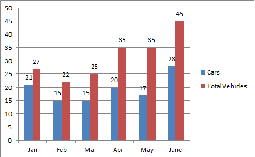
Study the above diagram and answer the questions (1 to 3) given below:
Instructions:
The following bar diagram shows the registration of cars and total vehicles during first six months of the year 1998 :
Study the above diagram and answer the questions (1 to 3) given below:
Registration of cars in May = 17000
Registration of cars in June = 28000
Increase = ((11000/17000)*100)% = 64.7%
Instructions:
The following bar diagram shows the registration of cars and total vehicles during first six months of the year 1998 :
Study the above diagram and answer the questions (1 to 3) given below:
Number of vehicles other than cars registered in March 1998 = (25000-15000) = 10000.
