Data Interpretation MCQ - Line Graph

What is Line Graph or Line Chart ?

  • A Line Graph is a way of plotting data points on a line. It is generally used to show trends in data.
  • It helps managers to take faster decisions.
  • One can represent a large amount of data using a simple Line Chart.

What are Line Chart Examples ? 

In this section you will find sufficient number of Line Chart Examples to make concepts clear.

Instructions:
Directions. The graph given below represents the variations in earnings in rupees over a week. Study the graph and answer questions given below
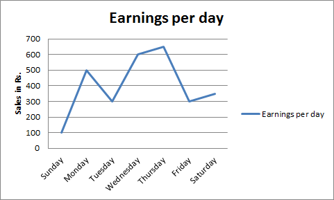
  The difference in earnings was large between

Correct AnswerOption A
Rate difficulty Rate difficulty:
Choose a difficulty.
Cancel reply

Your email address will not be published. Required fields are marked *


Cancel reply

Your email address will not be published. Required fields are marked *

Instructions:
Directions. The graph given below represents the variations in earnings in rupees over a week. Study the graph and answer questions given below

  The difference in earnings was large between
Correct AnswerOption C
Rate difficulty Rate difficulty:
Choose a difficulty.
Cancel reply

Your email address will not be published. Required fields are marked *


Cancel reply

Your email address will not be published. Required fields are marked *

Instructions:
Directions. The graph given below represents the variations in earnings in rupees over a week. Study the graph and answer questions given below

  The difference in earnings was large between
Correct AnswerOption B
Rate difficulty Rate difficulty:
Choose a difficulty.
Cancel reply

Your email address will not be published. Required fields are marked *


Cancel reply

Your email address will not be published. Required fields are marked *

Instructions:
Directions. The graph given below represents the variations in earnings in rupees over a week. Study the graph and answer questions given below

  The difference in earnings was large between
Correct AnswerOption A
Rate difficulty Rate difficulty:
Choose a difficulty.
Found this useful?
Follow:
Cancel reply

Your email address will not be published. Required fields are marked *


Cancel reply

Your email address will not be published. Required fields are marked *

Instructions:
Directions. The graph given below represents the variations in earnings in rupees over a week. Study the graph and answer questions given below

  The difference in earnings was large between
Correct AnswerOption B
Rate difficulty Rate difficulty:
Choose a difficulty.
Cancel reply

Your email address will not be published. Required fields are marked *


Cancel reply

Your email address will not be published. Required fields are marked *

Why Practice with Avatto?

High Quality MCQsExam-focused questions with accurate answers
Detailed ExplanationsStep-by-step explanations to enhance learning
Latest Exam PatternBased on updated syllabus and pattern
Performance AnalyticsTrack performance and improve weak areas
100% Free PracticePractice unlimited questions for free
Boost Your PreparationAttempt mock tests, previous year papers and topic-wise quizzes.Explore All Tests →