
With deep learning, we are not required to engineer the features since the deep neural network consists of several numbers of hidden layers. It implicitly learns and extracts the right set of features by itself. So, we don’t have to perform feature engineering by ourselves. Thus deep learning is widely used in the task where it is hard to perform feature engineering such as image recognition, text classification, and so on. Thus, in this way, deep learning differs from machine learning.
- The number of hidden neurons should be between the size of the input layer and the size of the output layer
- The number of hidden neurons should be 2/3 the size of the input layer, plus the size of the output layer
- The number of hidden neurons should be less than twice the size of the input layer
However, there is still not yet a standard right rule to set the number of neurons in the hidden layer.
- Number of neurons in the hidden layer
- Number of hidden layers
- The activation function in each layer
- Weight initialization
- Learning rate
- Number of epochs
- Batch size
- Dropouts
- Early stopping
- Regularization
- Data augmentation
For a simple problem, we can build the network with 2 or less than 2 hidden layers and for a complex problem, we can build a deep network with many hidden layers. As specified earlier, there is no rule of thumb in deciding the number of hidden layers.
a. Get data from various data sources available.
b. Generate research question from data.
c. Identify variables present in data. Also, identify important variables or variables to be analyzed as such.
d. Generate hypothesis.
e. Analyze data using graph data like histogram for example.
f. Fit a model from analyzed data.
g. Accept or reject the hypothesis.
h. Research question answer found.
Dependant/Outcome: A variable being affected, for example annual temperature in above example.
Independent/Predictor: A variable affecting the outcome for e.g. deforestation, pollution, and so on in above example
Bivariate variable: Involves study of relationship between two variables.
For Example While buying fruits from a vendor in kilograms, if we wanted 1 kilogram of fruits and the vendor’s weighing machine showed 1 kilogram when we brought the same. After checking the same in another machine, if the measured value shows 0.1 kilogram less than expected then this difference is what we call as measurement error.
For example, if we test the same value twice on the same entity then the results from the instrument should remain same if it has to be reliable. Such tests are known as test-retest.
a. Correlational research
This is also known as cross-sectional research This involves observing the natural pattern or occurrence to test Original occurrences are not manipulated
b. Experimental research
We select the variables of interest Then we manipulate some aspect of the environment Observe the effect on the selected variable
Systematic variation:
Introduced by experimenter
The participants are tested under different conditions and the difference in condition is introduced by experimenter
For Example to test use of woolen clothes w.r.t. temperature, we can test a group of 20 people, in both hot and cold climate. Thus, the difference introduced here is in terms of temperature only.
Unsystematic variation:
Introduced by random factors that exist between the experimental conditions.
For Example To test use of woolen clothes w.r.t. temperature, we can test a group of 20 people. Of the selected set some might behave differently than expected due to factors like illness and so on.
The difference in two conditions can be caused by the following:
The manipulation/changes that was carried out on the participants
Factors that might affect the way in which a participant performs from one time to the next
But we can approximate the same to three different levels like empty, full, or half empty and this now becomes discrete in nature.
For Example, Water representation in chemistry is H2O which represents two molecules of hydrogen and one molecule of oxygen. Thus, the ratio of elements is 2: 1.
| EmpNo | EName | Job | MGR | HireDa | Sal | Comm | DeptNo |
| 1234 | Amit | Waiter | 8382 | 19-Oct -18 | 50000 | 500 | 50 |
| 5678 | Ashish | Analyst | 8635 | 2-Nov-18 | 60000 | 200 | 51 |
FROM emp e
INNER JOIN dept d ON (e.DeptNo = d.DeptNo)
WHERE d.DName = ‘Account’
| DeotNo | Dname | Loc |
| 50 | Service | Delhi |
| 51 | Account | Mumbai |
| DeptNo | Dname | Loc |
| 50 | Service | Delhi |
| 51 | Account | Mumbai |
| EmpNo | EName | Job | MGR | HireDa | Sal | Comm | DeptNo |
| 1234 | Amit | Waiter | 8382 | 19-Oct -18 | 50000 | 500 | 50 |
| 5678 | Ashish | Analyst | 8635 | 2-Nov-18 | 60000 | 200 | 51 |
| EmpNo | EName | Job | MGR | HireDa | Sal | Comm | DeptNo |
| 1234 | Amit | Waiter | 8382 | 19-Oct -18 | 50000 | 500 | 50 |
| 5678 | Ashish | Analyst | 8635 | 2-Nov-18 | 60000 | 200 | 51 |
| EmpNo | EName | Job | MGR | HireDa | Sal | Comm | DeptNo |
| 1234 | Amit | Waiter | 8382 | 19-Oct -18 | 50000 | 500 | 50 |
| 5678 | Ashish | Analyst | 8635 | 2-Nov-18 | 60000 | 200 | 51 |
| EmpNo | EName | Job | MGR | HireDa | Sal | Comm | DeptNo |
| 1234 | Amit | Waiter | 8382 | 19-Oct -18 | 50000 | 500 | 50 |
| 5678 | Ashish | Analyst | 8635 | 2-Nov-18 | 60000 | 200 | 51 |
| EmpNo | EName | Job | MGR | HireDa | Sal | Comm | DeptNo |
| 1234 | Amit | Waiter | 8382 | 19-Oct -18 | 50000 | 500 | 50 |
| 5678 | Ashish | Analyst | 8635 | 2-Nov-18 | 60000 | 200 | 51 |
| EmpNo | EName | Job | MGR | HireDa | Sal | Comm | DeptNo |
| 1234 | Amit | Waiter | 8382 | 19-Oct -18 | 50000 | 500 | 50 |
| 5678 | Ashish | Analyst | 8635 | 2-Nov-18 | 60000 | 200 | 51 |
| EmpNo | EName | Job | MGR | HireDa | Sal | Comm | DeptNo |
| 1234 | Amit | Waiter | 8382 | 19-Oct -18 | 50000 | 500 | 50 |
| 5678 | Ashish | Analyst | 8635 | 2-Nov-18 | 60000 | 200 | 51 |
| EmpNo | EName | Job | MGR | HireDa | Sal | Comm | DeptNo |
| 1234 | Amit | Waiter | 8382 | 19-Oct -18 | 50000 | 500 | 50 |
| 5678 | Ashish | Analyst | 8635 | 2-Nov-18 | 60000 | 200 | 51 |
| EmpNo | EName | Job | MGR | HireDa | Sal | Comm | DeptNo |
| 1234 | Amit | Waiter | 8382 | 19-Oct -18 | 50000 | 500 | 50 |
| 5678 | Ashish | Analyst | 8635 | 2-Nov-18 | 60000 | 200 | 51 |
| EmpNo | EName | Job | MGR | HireDa | Sal | Comm | DeptNo |
| 1234 | Amit | Waiter | 8382 | 19-Oct -18 | 50000 | 500 | 50 |
| 5678 | Ashish | Analyst | 8635 | 2-Nov-18 | 60000 | 200 | 51 |
| EmpNo | EName | Job | MGR | HireDa | Sal | Comm | DeptNo |
| 1234 | Amit | Waiter | 8382 | 19-Oct -18 | 50000 | 500 | 50 |
| 5678 | Ashish | Analyst | 8635 | 2-Nov-18 | 60000 | 200 | 51 |
| EmpNo | EName | Job | MGR | HireDa | Sal | Comm | DeptNo |
| 1234 | Amit | Waiter | 8382 | 19-Oct -18 | 50000 | 500 | 50 |
| 5678 | Ashish | Analyst | 8635 | 2-Nov-18 | 60000 | 200 | 51 |
| EmpNo | EName | Job | MGR | HireDa | Sal | Comm | DeptNo |
| 1234 | Amit | Waiter | 8382 | 19-Oct -18 | 50000 | 500 | 50 |
| 5678 | Ashish | Analyst | 8635 | 2-Nov-18 | 60000 | 200 | 51 |
| EmpNo | EName | Job | MGR | HireDa | Sal | Comm | DeptNo |
| 1234 | Amit | Waiter | 8382 | 19-Oct -18 | 50000 | 500 | 50 |
| 5678 | Ashish | Analyst | 8635 | 2-Nov-18 | 60000 | 200 | 51 |
| EmpNo | EName | Job | MGR | HireDa | Sal | Comm | DeptNo |
| 1234 | Amit | Waiter | 8382 | 19-Oct -18 | 50000 | 500 | 50 |
| 5678 | Ashish | Analyst | 8635 | 2-Nov-18 | 60000 | 200 | 51 |
| EmpNo | EName | Job | MGR | HireDa | Sal | Comm | DeptNo |
| 1234 | Amit | Waiter | 8382 | 19-Oct -18 | 50000 | 500 | 50 |
| 5678 | Ashish | Analyst | 8635 | 2-Nov-18 | 60000 | 200 | 51 |
Suppose, we are near to attaining convergence and when the value of momentum is high, then the momentum pushes the gradient step high and we miss out on the minimum value, that is we overshoot the minimum value.
1) Adagrad
2) Adadelta
3) RMSProp
4) Adam
5) Adamax
6) AMSGrad
7) Nadam
- Weight = weight - learning rate x derivatives
we don’t have to check whether analytical and numerical gradients are exactly the same since the numerical gradient is just an approximation. So, we compute the difference between the analytical and numerical gradients and if their difference is very small say 1e-7 then our implementation is correct else we have a buggy implementation.
Group by rollno
Having count (rollno)>1
Order by count (rollno) desc;
Parenthesis
Exponentiation
Multiplication/Division
Addition
Subtraction
a)Three convolutional layers
b)Two pooling layers
c)One fully connected layer
d)One output layer
Suppose, we have a convolutional layer with a 5 x 5 filter then it can be broken down into two convolutional layers with 3 x 3 filters.
1) Max pooling
2) Average pooling
3) Sum pooling
Convolutional layer
Pooling layer
Fully connected layer
Ex: If you have taken a personal loan, and if you can able to pay the EMI of 6K instead of 10K, how many months do you need to close your personal loan?
Assigning a macro to a button
Run a macro from the ribbon
Run a macro using a keyboard short cut key.
Using OFFSET and COUNTA Functions
FUNCTION – is a built-in formula by Excel. Ex: =SUM(1+2+3)
Timeline – is used to filter the dates interactively by Year, Month, Quarter, and Day.
COUNTA – Counts the number of cells which contains alpha-numeric except blank cells.
Q9)Is it possible to make a single Pivot Table for multiple data sources? Yes, it is possible. Using the Pivot Table Data Modeling technique.
INDEX-MATCH – Using a combination of INDEX and MATCH, we can retrieve the data from left to right/right to left in a range/table.
Ex: $A $1 – Here Locked Column A and row 1
ActiveWorkbook – is the workbook which is in Active state at present.
Breakpoints – F9
Using Debug.Print
Immediate Window
Watch Window
ODBC – Open Database Connectivity is useful to get the data from the external database.
OLEDB – Object Linking and Embedding, Database.
#DIV/0!
#VALUE!
#REF!
#NAME
#NUM
Reports: Reports are not live and we use historical data to make reports. sometimes Reports are included with visuals such as Table, Graphs and Charts, Text, Numbers or anything.
Functions
ByVal
ByRef
User form: Helps to develop GUI (Graphical User Interface) applications.
Class Module: Allows to create new objects.
Thisworkbook Module
Code Module
Userforms
Class Modules
Turn off screen updating
Declare the variables and avoid the “Variant” data type.
Disable events
Using the WITH statement.
Avoiding the Select statement
Select Case instead of If Then
On Error Goto 0
On Error Resume Next
On Error Goto [Label]
Err Object
Err. Number
Err. Description of
Err. Source
Err. Raise
Error Function
Error Statement
Explicit Declaration: Declaring variables before using is called Explicit Declaration.
Single Dimensional Array: Single Dimensional array is used more often in the VBA. An array uses only one index. Multi-Dimensional Array: If an array has more than 1 dimension is called Multi-Dimensional Array.
TEXT( ) – Converting a value into text formatting
PROPER ( ) – Arranging the characters in a proper way.
LEFT ( ) – Returns the specified number of characters from the starting character.
Considering an ordinary, urban household with 4 individuals
Number of Maggi needed per month = 10
Therefore, per head consumption = (10/4) = 2.5 Maggi per person
Population = 1.3 billion
Urban population: 70% of total population
Above poverty line population: 40% of total population
Therefore, net population to consider:
1300*0.7*0.4 = 364 million. Population distribution: (Age-wise)
0 – 10 (consume less than 2.5 packets per month, say 2 packets): 20% of the population {which equals to (364*0.2*2) million packets per month = 145.6 million packets per month}
10 – 60 (consume 3 packets per month): 65% of the population {which equals to (364*0.65*3) million kg per month = 709.8 million packets per month}
60+ (consume less than 2.5 packets per month, 2 packets): 15% {which equals to (364*0.15*2) million packets per month = 109.2 million packets per month}
Total approximate consumption = (145.6 + 709.8+109.2) million packets/month = 964.6 million packets/month
Assuming a month of 30 days, per day consumption = (964.6/30) million packets per day = 32.15 million packets per day.
Demand side
Supply side
I am going to solve using demand of t-shirts in the market
Total population of india : 1 bn (approx) Reach to internet : 40% =400 Mn
Reach of ecommerce companies to deliver products : 3/4th = 300Mn
Let's assume 50% are male and 50% are female
Lets solve for male population first: Now i have divided males in the four categories on the basis of age because demand demand of t-shirts for different age groups will be different
0–15 yr = 45 Mn, on an average, individual own 4 t shirts -> 4*45=180 Mn
16–22 yr = 23 Mn, on an average individual own 4 t shirts -> 4*23 = 92 Mn
23–50 yr = 65 Mn, on an average individual own 3 t shirts -> 3*65 = 195 Mn
50 - 80 yr = 18 Mn, on an average individual have 2 t shirts -> 2*18 = 36 Mn
Total t shirts own by men : 180 + 92+195+36 = 503 Mn ~ 500 Mn
Let's solve for female population now:
0–15 yr = 45 Mn, on an average individual own 2 t shirts -> 2*45=90 Mn
16–22 yr = 23 Mn, on an average individual own 4 t shirts -> 4*23 = 92 Mn
23–30 yr = 15 Mn, on an average individual own 3 t shirts -> 3*15 = 45 Mn
30 - 80 yr = 67 Mn -> we can neglect this section. Only a few ladies prefer to use t-shirts in this age group.
Total t-shirts own by females: 90+92+45 = 227 Mn ~ 230 Mn
Total t-shirts own by men + women = 500+230=730 Mn
Average life of a t-shirt = 2-year
Demand per year = 365 Mn ~ 360 Mn
Online portals provide coupons and offers but because of trust factor and fitting issues, people in India still prefer to buy offline, So I am assuming 30% of people buy a t-shirt from eCommerce portal and 70% are buying from market.
Total number of t-shirts sold through eCommerce platform per year in India= .3*360 = 108 Mn ~ 100 Mn per year
Number of t-shirts sold in India per day(From eCommerce portal) = 100 * 10^6/365 ~ 27,000
Population below 14 years: 30%
Hence, proxy figure: 588 mn
Rural Population (70%): 410 mn
Rural Households: 82 Mn
Rural Mobile Penetration: Avg 2 per
household- 164 Mn
In rural areas assume that a new mobile is bought once in 3 years. Hence, new mobiles bought In the current year- 55 Mn Urban (30%):176 Mn
Assume Avg No of Mobiles per person: 1.5
Urban Mobile Penetration: 265 Mn
Assuming that a new mobile is bought once in 1.5 years. Hence new mobiles in the current year- 176 Mn
Total New Mobiles: 231 mn
Assuming 3 out of 10 new mobiles are smartphones
No. of smartphones sold=70 Mn
35 million students enroll in India(Undergraduate, graduate, doctorate, diploma)
72% of 35 million graduate every year = 25 million
Students completing 10th grade = 20 million
Students completing 12th grade= 15 million
Unemployed graduates of the previous year= 15 million (Since 60% of 25 million graduates are unemployed)
GDP growth rate is 7%
Calculations:
40% of 25 million graduates are only employed= 10 million
Assuming 500,000 of the previous year’s graduates get a new job
100,000 starts working after 12th grade due to poverty, poor grades, etc
An estimate of 50,000 starts working after 10th grade due to poverty, poor grades, etc
10,000 people already on workforce end up with a new job
Total= 10 million + 500,000 + 100,000 + 50,000 + 10,000 = 10.66 million (approx)
Note:
Migrants working in India are negligible Due to urbanization, very few go for work without completing their 10th grade Increased feminism has a significant effect on the estimates
OYO Rooms Case Study
a. Online Rating
b. Occupancy %
c. Average daily rate
d. Revenue per available room
e. Customer Satisfaction
f. Advertising ROI
- Video ads on youtube
- Pamphlet distribution
- Hoarding
- Email/SMS
Let's solve the guesstimate
The population of Delhi: 20 Mn
Children or college going = 20% of 20 Mn -> 4 Mn
Senior citizens = 20% of 20 Mn -> 4 Mn
Working people = 60% of 20 Mn -> 12 Mn
let there are 5 brands of car and each brand has 10 cars that are equally distributed. So in total, we have 50 models of cars running in the streets. This does not include luxury cars.br> Working-class people, let's assume half are married and half remain unmarried. So married -> 6 Mn and unmarried -> 6 Mn
Married couples:-
Number of married couples = 6 Mn/2 -> 3 Mn
I am assuming 10% belong to the rich class and prefer luxury cars and 20% cannot afford a car. The rest 70% has one car each.
70% of 3 Mn = 2.1 Mn
There is an equal distribution of above mentioned 50 cars among these 2.1 couples again. So the number of Swift Cars right now is 2.1 Mn / 50 = 0.042 Mn. I am assuming Swift car comes in 10 colors. Hence a number of red swift cars in married couples is 0.0042 Mn -> 42,000
Unmarried couples:-
Out of 6 Mn unmarried couples, Only 10% can afford mid-range nonluxury cars. Hence no of cars = 6 lakh. These are again divided into 50 models as above and each model has 10 colors. So number of red-colored swift cars among unmarried unmarried people = 6 lakh / 500 -> 12,000
Senior citizens
Out of 2 Mn families(4 Mn people), 20% i.e. 0.4 Mn families own a car. Again, as above, these cars are divided into 50 models with each model having 10 colors. So 4 lakh/500 -> 8,000
Total number of red-colored swift cars in Delhi = 42,000 + 12,000 + 8,000 -> 62,000
The candidate would begin by discussing the market dynamics in Brazil as well as globally on which he/she has to base the suggestion. Furthermore, an idea is to be framed up about the cost, market, value, customers, transportation facility, and price if the steel is to be exported. Also, Brazil has some taxes on foreign goods export which would only add up to the price. Since the local market is more profitable than international trade, it is advisable to try out the products first in the local market of Brazil since there is a chance of price war.
> first <- c(1,2,3,4)
> second <- (“a”, “b”, “c”)
> third <- c(first, second)
> print(third)
[1] “1” “2” “3” “4” “a” “b” “c”
In array, you need to give the dimension of the array. An array can be of any number of dimensions and each dimension is a matrix. For example, a 3x3x2 array represents 2 matrices each of dimension 3x3.
So, the data frame can have a different vector of character, numbers, logic, etc. and it is still cool. But, for a matrix, you need only one type of data type.
> name <- c(“Pappu”, “John”)
> temp <- 5
> repeat {print(name)
temp <- temp+2
if(temp > 11) {
break
}
}
So, this will return the name vector 4 times. First, it prints the name and then increase the temp to 7 and so on.
This derivative and weights, both of which are a small number. When we multiply two numbers which are small then the result will be a smaller number. So, when we multiply the weights and derivative at every step then our gradient becomes an infinitesimally small number and this is called vanishing gradient problem.
Example
> name <- c(“Pappu”, “John”)
> temp <- 5
> repeat (temp<11){
print(name)
temp <- temp+2
}
>x<- LETTERS[1:2]
for ( i in x) {
print(i)
}
[1] “A”
[2] “B”
function body
}
The argument is the place holder, whenever a function is invoked, it passes a value to the argument. Arguments are optional
Example.
>temp <- c(3,5,2,6,7,1)
>sort_temp<- sort(temp)
>print(sort_temp)
[1] 1 2 3 5 6 7
>rev_sort<- sort(temp, decreasing = TRUE)
[1] 7,6,5,3,2,1
This function also works with the words
**Suppose there is adata.frame
data_frame_example<- data.frame(a = c(10, 20, 30), b = c(40, 50, 60), c(70, 80, 90))...
Thus, the answer is 35
print(max_salary_person)
write.csv(temp,”output.csv”,row.names = FALSE)
new_temp<- read.csv(“output.csv”)
print(new_temp)
a<- c(1,2,3,4)
b<- c(“Amit”,”Sumit”,”Gaurav”)
c<- c(“TCS”,”CTS”,”Musigma”)
df<- cbind(a,b,c)
print(df)
Example.
df1<- data.frame(id<- c(1:6), name <- c(rep(“Amit”,3), rep(“Sumit”,3))
df2<- data.frame(id<-c(7,8,9), name<- c(rep(“Nitin”,2), rep(“Paplu”,1))
*outer join
merge(x=df1, y=df2, by = “id”, all = TRUE)
This all = TRUE will give you the outer join, so the new data set will have all the value from both the data frame merged on the id
We can think of placeholders as variables, where we only define the type and dimension, but do not assign the value. Values for the placeholders will be fed at runtime.
The contractive autoencoders use a new penalty term in the loss function which penalizes the representations that are too sensitive to the input.
To combat this problem of overfitting, we need a sparse autoencoder.
While learning the representation of the input, the encoder will learn that the noise is unwanted information and removes its representation. Thus, the encoder learns the compact representation of the input without including the noise and by keeping only necessary the information and map the learned representation to the bottleneck.
Next, the decoder takes the bottleneck created by the input and reconstructs the image. Since the bottleneck does not contain any representation of the noise, the decoder can generate a denoised image from the bottleneck.
Next, we apply the max pooling operation to retain only the important features of the image and obtain a latent representation of the image, called a bottleneck.
To the decoder, we feed the bottleneck as an input. The decoder consists of deconvolutional layers and it performs the deconvolution operation and tries to reconstruct the image from the bottleneck.
Use the below syntax for the use.
my_data<- read.csv(“filename.csv”, stringsAsfactors = FALSE, strip.white=TRUE, na.strings=c(“NA”,””))
stringsAsFactors = FALSE tells R to keep
character variables as they are rather than convert to factors.
strip.white = TRUE removes spaces at the start and end of character elements. R treats “game” and ” game” differently, which is not usually desired.
na.strings = c("NA","") tells R that in addition to the usual NA, empty strings in columns of character data are also to be treated as missing
Example.
x<- list(a=1, b=1:3, c=10:100)
lapply(x,FUN=length)
$a
[1]1
$b
[1]3 $c
[1]91
You can use other functions like max, min, sum, etc.
Vector is useful sometimes because it will get you a set of values and you can easily perform an operation on it.
Example.
x <-list(a =1, b =1:3, c =10:100)
#Compare with above; a named vector, not a list
sapply(x, FUN = length)
a b c
1391 sapply(x, FUN = sum)
a b c
165005
The syntax for scatterplot is:-
plot(x, y ,main, xlab, ylab, xlim, ylim, axes)
Where
x is the data set whose values are the horizontal coordinates
y is the data set whose values are the vertical coordinates main is the tile in the graph xlab and ylab is the label in the horizontal and vertical axis xlim and ylim are the limits of values of x and y used in the plotting axes indicate whether both axes should be there on the plot
plot(x =input$wt,y=input$mpg,
xlab="Weight",
ylab="Milage",
xlim= c(2.5,5),
ylim= c(15,30),
main="Weight vsMilage")
countdown(5)
[1] 5
[2] 4
[3] 3
[4] 2
[5] 1
for name,number in lucky_number.items():
print(name+’prefers’+str(number))
for name in lucky_number.keys():
print(name)
with open(filename) as file_object:
lines = file_object.readlines()
for line in lines:
print(line)
inp = input(x)
try:
inp = int(inp)
except ValueError:
print(“Sorry, Please Try again latter”)
else:
print(“That’s a beautiful age “)
while(i < 20):
j = 2
while(j i/j) :
print (i," is a prime number")
i = i + 1
print(list_example)
list_example[1] = 'Kamal'
print(list_example)
['Amit', 'Sumit', 'Rahul']
['Amit', 'Kamal', 'Rahul']
for x in game_name
print(x)
example = [‘Cricket’,’Football’,’TT’]
game_name(example)
print("\nMaking a " + size + " pizza.")
print("Toppings:")
for topping in toppings:
print("- " + topping)
# Make three pizzas with different toppings.
make_pizza('small', 'pepperoni')
make_pizza('large', 'bacon bits', 'pineapple')
make_pizza('medium', 'mushrooms', 'peppers', 'onions', 'extra cheese')
from sklearn.model_selection import train_test_split
X_train,X_test,Y_train,Y_test = train_test_split(dataframe_name,target_variable,test_size=0.3, random_state=42)
dataframe_name = the complete dataset as a panda dataframe target_variable = the name of the target variable test_size = 0.3 denotes 70-30 split of the dataset in train and test random_state = 42, Look for the explanation in the next question
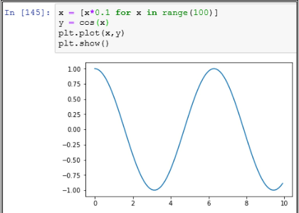
Data Structure: We have to select the right data structure for our purpose in a Python program.
Standard Library: Wherever possible, we should use methods from the standard library. Methods implemented in the standard libraries have much better performance than user implementation.
Abstraction: At times, a lot of abstraction and indirection can cause slow performance of a program. We should remove the redundant abstraction in code.
Algorithm: The use of the right algorithm can make a big difference in a program. We have to find and select a suitable algorithm to solve our problem with high performance.
Efficient: Python is very efficient in memory management. For a large data set like Big Data, it is much easier to program in Python.
Faster: Though Python code is interpreted, still Python has a very fast performance.
Wide usage: Python is widely used among different organizations for different projects. Due to this wide usage, there are thousands of add-ons available for use with Python.
Easy to learn: Python is quite easy to learn. This is the biggest benefit of using Python. Complex tasks can be very easily implemented in Python.
# -*- coding: encoding -*-
In the above line, we can replace encoding with the encoding that we want to use.
Python has a module named pickle. This module has the implementation of a powerful algorithm for serialization and de-serialization of Python object structure.
Some people also call Pickling as Serialization or Marshalling.
With Serialization, we can transfer Python objects over the network. It is also used in persisting the state of a Python object. We can write it to a file or a database.
There are different components in Python memory manager that handle segmentation, sharing, caching, memory pre-allocation, etc.
Python memory manager also takes care of garbage collection by using Reference counting algorithm.
PyChecker can detect errors in Python code. PyChecker also gives warnings for any style issues.
Some other tools to find bugs in Python code are pylint and pyflakes.
1) Syntax: A Tuple is enclosed in parentheses: E.g. myTuple = (10, 20, “apple”);
A List is enclosed in brackets: E.g. myList = [10, 20, 30];
2) Mutable: Tuple is an immutable data structure. Whereas, a List is a mutable data structure.
3) Size: A Tuple takes much lesser space than a List in Python.
4) Performance: Tuple is faster than a List in Python. So it gives us a good performance.
5) Use case: Since Tuple is immutable, we can use it in cases like Dictionary creation. Whereas, a List is preferred in the use case where data can alter.
Since some of the objects passed as reference are mutable, we can change those objects in a method. But for an Immutable object like String, any change done within a method is not reflected outside.
The advantage of the COALESCE() function over the NVL() function is that the COALESCE function can take multiple alternate values. In simple words COALESCE() function returns the first non-null expression in the list.
| EmpNo | EName | Job | MGR | HireDate | Sal | Comm | DeotNo |
| 1234 | Amit | Waiter | 8382 | 19-Oct-18 | 50000 | 500 | 50 |
| 5678 | Ashish | Analyst | 8635 | 2-Nov-18 | 60000 | 200 | 51 |
FROM user_tables
WHERE table_name=’Employee’;
| EmpNo | EName | Job | MGR | HireDate | Sal | Comm | DeptNo |
| 1234 | Amit | Waiter | 8382 | 19-Oct-18 | 50000 | 500 | 50 |
| 5678 | Ashish | Analyst | 8635 | 2-Nov-18 | 60000 | 200 | 51 |
SELECT column_name(s)
FROM table_name
ORDER BY column_name
OFFSET rows_to_skip
FETCH NEXT number_of_rows ROWS ONLY;
| DeptNo | Dname | Loc |
| 50 | Service | Delhi |
| 51 | Account | Mumbai |
Max(Salary)
FROM Department_Table
GROUP BY Department_Name
FROM – Choose and join tables to get the raw data
WHERE – First filtering condition
GROUP BY – Aggregates the base data
HAVING – Apply condition on the base data
SELECT – Return the final data
ORDER BY – Sort the final data
LIMIT – Apply a limit to the returned data
Sample query:- SELECT emp.*, row_number() over (order by salary DESC) Row_Number from Employee emp;
| Employee Name | Salary | Row_Number |
| Amit | 7000 | 1 |
| Bhargav | 6000 | 2 |
| Chirag | 6000 | 3 |
| Dinesh | 5000 | 4 |
| Esha | 3000 | 5 |
| Farhan | 3000 | 6 |
Even when the salary is the same for Bhargav and Chirag, they have a different Row_Number, this means that the function row_number just gives a number to every row
| Employee Name | Salary | Row_Number |
| Amit | 7000 | 1 |
| Bhargav | 6000 | 2 |
| Chirag | 6000 | 2 |
| Dinesh | 5000 | 4 |
| Esha | 3000 | 5 |
| Farhan | 3000 | 6 |
| Employee Name | Salary | Row_Number |
| Amit | 7000 | 1 |
| Bhargav | 6000 | 1 |
| Chirag | 6000 | 2 |
| Dinesh | 5000 | 2 |
| Esha | 3000 | 3 |
| Farhan | 3000 | 3 |
| Employee Name | Salary | Row_Number |
| Amit | 7000 | 1 |
| Bhargav | 6000 | 2 |
| Chirag | 6000 | 2 |
| Dinesh | 5000 | 3 |
| Esha | 3000 | 4 |
| Farhan | 3000 | 5 |
| Employee Name | Salary | Row_Number |
| Amit | 7000 | 1 |
| Bhargav | 6000 | 2 |
| Chirag | 6000 | 3 |
| Dinesh | 5000 | 4 |
| Esha | 3000 | 5 |
| Farhan | 3000 | 6 |
FROM Employee
where EmpName like ‘[aeiou]%’
| Employee Name | Salary | Row_Number |
| Amit | 7000 | 1 |
| Bhargav | 6000 | 2 |
| Chirag | 6000 | 3 |
| Dinesh | 5000 | 4 |
| Esha | 3000 | 5 |
| Farhan | 3000 | 6 |
FROM Employee
where EmpName like ‘[aeiou]%[aeiou]’
a. DDL – Data Definition Language
b. DML – Data Manipulation Language
c. DCL – Data Control Language
a. Create – Create is for creating tables to CREATE TABLE table_name ( column1 data type, column2 data type, column3 datatype,....
);
b. Alter – Alter table is used to modifying the existing existing table object in the database. ALTER TABLE table_name
ADD column_name datatype
c. Drop – If you drop a table, all the rows in the table are deleted and the table structure is removed from the database. Once the table is dropped, you can’t get it back
b. COUNT()
c. MAX()
d. MIN()
e. SUM()
There are 5 forms of Normalization
First Normal Form (1NF): It removes all duplicate columns from the table. Creates a table for related data and identifies unique column values
Second Normal Form (2NF): Follows 1NF and creates and places data subsets in an individual table and defines the relationship between tables using a primary key
Third Normal Form (3NF): Follows 2NF and removes those columns which are not related through primary key
Fourth Normal Form (4NF): Follows 3NF and does not define multi-valued dependencies. 4NF also known as BCNF
OFFSET can only be used with the ORDER BY clause. It cannot be used on its own. OFFSET value must be greater than or equal to zero. It cannot be negative, else return an error. SELECT column_name(s)
FROM table_name
WHERE condition
ORDER BY column_name
OFFSET rows_to_skip ROWS;
DROP SCHEMA schema_name RESTRICT;
DROP Table table_name CASCADE;
DELETE is a Data Manipulation Language (DDL) command and used when you want to remove some or all the tuples from a relation. If WHERE clause is used along with the DELETE command it removes only those tuples which satisfy the WHERE clause condition but if WHERE clause is missing from the DELETE statement then by default all the tuples present in relation are removed.
DELETE FROM relation_name
WHERE condition;
There were some output related questions where a table was given, mostly on the group by, order by, top, etc. command
That is, when we implement the gradient descent method for the complex neural network, even with buggy implementations, the network will learn something.
But the buggy implementation will not be as optimal as a bug-free implementation. So to ensure that we have the bug free implementation of gradient descent we perform gradient checking.
Say n is 32, then it implies that we update the parameter of the network after iterating through every 32 data points in our training set.
This oscillation leads to slow training time and makes it's hard to reach the convergence. To avoid this issue we use momentum-based gradient descent.
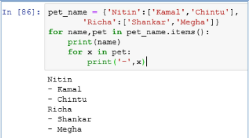
'Richa':['Shankar','Megha']}
for name,pet in pet_name.items():
print(name)
for x in pet:
print('-',x)
Stochastic gradient descent - Update the parameter of the network after iterating through every single data points present in the training set.
Mini-batch gradient descent - Update the parameter of the network after iterating through some n number of data points present in the training set.
Dictionary is an efficient way to store data that can be looked up based on a key.
[]
Even though the list has only 2 elements, the call to thelist with index 3 does not give any index.
Pandas: Powerful Python Data Analysis Toolkit
SciKit: This is a machine learning library in Python.
Seaborn: This is a statistical data visualization library in Python.
SciPy: This is an open source system for science, mathematics and engineering implemented in Python.
In addition to that we have to add following line as the first line in a Python script file.
#!/usr/local/bin/python
This will tell Unix to use Python interpreter to execute the script.
E.g. >>> thelist=['a','b']
>>> for i,j in enumerate(thelist): ...
print i,j
...
0 a
1 b
Python provides built-in functions that can be used for Functional programming. Some of these functions are:
Map()
reduce()
filter()
Event iterators and generators can be used for Functional programming in Python.
This common module can be imported in all the modules in which we want to share the variables.
In this way, all the shared variables will be in one module and available for sharing with any new module as well.
We use ‘==’ to check equality of two objects.
E.g.
>>> lst = [10,20, 20]
>>> lst == lst[:]
True
>>> lst is lst[:]
False
We can call it from our code as well as from the interpreter.
It gives use the number of function calls as well as the total time taken to run the script.
We can even write the profile results to a file instead of standard out.
import pdb
pdb.set_trace()
After adding these lines, our code runs in debug mode. Now we can use commands like breakpoint, step through, step into etc for debugging.
E.g. int is not a subclass of long
>>> issubclass(int,long)
False
bool is a subclass of int
>>> issubclass(bool,int)
True
E.g. 'a b c '.split() returns [‘a’, ‘b’, ‘c’]
Slicing is a way of getting substring from a String. It returns another String.
E.g. >>> 'a b c'[2:3] returns b
E.g. >>> if student_score < 0: raise ValueError(“Score can not be negative”)
If we do not want to stop the program, we can just catch the error condition, print a message and continue with our program.
E.g. In following code snippet we are catching the error and continuing with the default value of age.
#!/usr/bin/python
try:
age=18+'duration'
except:
print("duration has to be a number")
age=18
print(age) Powerhouse, Knowledge. Top 50 Python Interview Questions and Answers . Kindle Edition.
We call append() method to add an item to the end of a list.
We call extend() method to add another list to the end of a list.
In append() we have to add items one by one. But in extend() multiple items from another list can be added at the same time.
We have to first connect to a specific database by passing URL, username, password and the name of database.
Once we establish the connection, we can open a cursor with cursor() function. On an open cursor, we can run fetch() function to execute queries and retrieve data from the database tables.
-local income levels
-proximity to traffic
-weather
-population density
-proximity to other businesses
-a reference dataset on local, regional, and national macroeconomic conditions (e.g. unemployment, inflation, prime interest rate, etc.)
-Any data on the local franchise owner-operators, to the degree the manager
-Identify a set of KPIs acceptable to the management that had requested the analysis concerning the most desirable factors surrounding a franchise. Quarterly operating profit, ROI, EVA, pay-down rate, etc.
-Run econometric models to understand the relative significance of each variable
-Run machine learning algorithms to predict the performance of each location candidate
We can do functional, procedural, object-oriented, and imperative programming with the help of Python.
It is similar to a dictionary in Python, but it maintains the insertion order of keys in the dictionary collection.
With Modules, we can divide the functionality of our application in smaller chunks that can be easily managed.
It can also be used floordiv(a,b).
E.g.
10// 4 = 2
-10//4 = -3
We can use it to aggregate Iterable objects from two iterators as well.
E.g.
list_1 = ['a', 'b', 'c']
list_2 = ['1', '2', '3'] for a, b in zip(list_1, list_2):
print a, b
Output:
a1
b2
c3
By using zip() function we can divide our input data from different sources into fixed number of sets.
We can use None as a default argument in a function.
During comparison we have to use “is” operator instead of “==” for None.
One of the most common metaclass in Python is type. We can subclass type to create our own metaclass.
We can use metaclass as a class-factory to create different types of classes.
xl = [3,4,5,6,7]
x = np.asarray(xl).reshape(-1, 1)
y = [15,22,25,33,40]
lm = linear_model.LinearRegression()
lm.fit(x, y)
print(lm.intercept_)
print(lm.coef_[0])
Time taken to pass the boy=` [120 xx 3/55]` sec = 6.54 seconds
Hence, we have `(8/100)`×b=4. Solving for b yields b = 50. Now, c=`b/a`=`50/200`=`1/4.`
Time taken by P to cover 100 m = `(100 ** 18/30)`m/sec =60 sec
Time taken by Q to cover 92 m = (60 + 8) = 68 sec.
Q's speed =`("Distance"/"Time"**18/5) kmph =(92/68 ** 18/5)` kmph = 4.86kmph.
Therefore , Sum of their ages 4 years ago = 92 – (4 * 3)= 80 years.
4 years ago ratio of the ages of A , B and C was = 1:2:3
Therefore, A’s age four years ago = `1/6` * 80 = 13.3 years.
So , A’s present age =13.3 + 4 = 17.3 years
A guy bought 10 pencils for Rs. 50 and sold them for Rs. 60.What is his gain in terms of percentage?
Noise in the Data Set
Outliers
Mixture of Different Languages (like English and Chinese)
Range Constraints
Disease screening
Imbalanced Data Set means that the population of one class is extremely large than the other (Eg: Fraud – 99% and Non-Fraud – 1%) Imbalanced dataset can be handled by either oversampling, undersampling and penalized Machine Learning Algorithm.
Decision Trees and Random Forest
SVM
Naïve Bayes
XGBoost
-Adding more columns (or) removing columns from the existing column
-Outlier Detection
-Normalization etc
Example: In the Data Set if you have grades of 2nd PUC and marks of 2nd PUC, Then both give the same trend to capture, which might internally hamper the speed and time.so we need to check if the multicollinearity exists by using VIF(variance Inflation Factor).
Note: if the Variance Inflation Factor is more than 4, then multicollinearity problem exists.
In Decision Tree, We can use information gain(which internally uses entropy)
In Random Forest, We can use varImpPlot
select the form for the function and learn the coefficients
False Negative – A cancer screening test comes back negative, but you have cancer
True Positive – A Cancer Screening test comes back positive, and you have cancer
True Negative – A Cancer Screening test comes back negative, and you don’t have cancer
We can even do automation of tests with these modules. Some of the main components of unittest are as follows:
Test fixture: We use test fixture to create preparation methods required to run a test. It can even perform post-test cleanup.
Test case: This is main unit test that we run on a piece of code. We can use Testcase base class to create new test cases.
Test suite: We can aggregate our unit test cases in a Test suite.
Test runner: We use test runner to execute unit tests and produce reports of the test run.
The main difference between Javadoc and Docstring is that docstring is available during runtime as well. Whereas, Javadoc is removed from the Bytecode and it is not present in .class file.
We can even use Docstring comments at run time as an interactive help manual.
In Python, we have to specify docstring as the first statement of a code object, just after the def or class statement.
The docstring for a code object can be accessed from the '__doc__' attribute of that object.
Specificity means “proportion of actual negatives that are correctly classified” “True Negative”
If you are dealing with continuous/discrete values, then go for Linear Regression.
Mean imputation
Median Imputation
MICE
miss forest
Amelia
AIC is the measure of fit which penalizes model for the number of model coefficients. Therefore, we always prefer the model with minimum AIC value.
Note: Log is à base 2
In such a scenario, the initial data is predicted with high accuracy by the model. But with any additional data, the model predicts with much lesser accuracy. This defeats the purpose of the model.
E.g. Let say, we want to predict the type of fruit-based on its height, width, color, and weight. There may be some outliers in our data. Like- a yellow color apple.
If we make our model complicated, it may accurately predict such an object of yellow color to be an apple. But in actual data there maybe lemons. Due to overfitting, our model will start predicting lemons as apples based on color.
One simple way to understand overfitting is that our information from past experiences can be divided into two groups.
1. Information that is relevant for prediction
2. Information that is irrelevant for prediction. It is also called noise.
Whenever there is more noise, it is more difficult for a model to predict correctly. It is a difficult problem for a model to determine which part should be ignored. Once we have a robust learning algorithm, the chance of fitting noise reduces drastically.
Use K-Fold cross-validation techniques Make use of drop-put in case of neural network
How the root node is predicted in Decision Tree Algorithm?
Mathematical Formula “Entropy” is utilized for predicting the root node of the tree.
Overfitting also happens when a model tries to memorize the training data instead of learning from training data.
Once we come to an optimum set of parameters for the model, the overfitting stops. If we increase the number of parameters beyond the optimum level, overfitting occurs.
If our model performs better on training set than on test set, it means there is overfitting in our model. In such a scenario we have high variance in our model. To reduce overfitting, we can find ways to reduce variance in the model. .
Theano
CNTK
Q126. Name Few Deep Learning
Algorithm
TensorFlow
Theano
Lasagne
mxnet
blocks
Keras
CNTK
TFLearn
Ensemble learning is used when you build component classifiers that are more accurate and independent from each other.
SVM suits best for Text Classification Model and Random Forest suits for Binomial/Multinomial Classification Problem.
Random Forest takes care of overfitting problem with the help of tree pruning
Image Classification
Text Classification
Search Engine
Banking, Healthcare Domain
The order of precedence is ** then *.
Thus 3**2 = 9 and then 9*3 = 27.
list_example = list(tup)
print(list_example)
[‘the’,’Data’,’Monk’]
print (str)
print (str*2)
print (str[2:5])
print (str[3:])
print (str + ".com")
print ("www."+str+".com")
TheDataMonk
TheDataMonkTheDataMonk
eDa
DataMonk
TheDataMonk.com
www.TheDataMonk.com
Step 2: Find the median. 1, 2, 5, 6, 7, 9, 12, 15, 18, 19, 27.
Step 3: Place parentheses around the numbers above and below the median. Not necessary statistically, but it makes Q1 and Q3 easier to spot. (1, 2, 5, 6, 7), 9, (12, 15, 18, 19, 27).
Step 4: Find Q1 and Q3 Think of Q1 as a median in the lower half of the data and think of Q3 as a median for the upper half of data. (1, 2, 5, 6, 7), 9, ( 12, 15, 18, 19, 27). Q1 = 5 and Q3 = 18.
Step 5: Subtract Q1 from Q3 to find the interquartile range. 18 – 5 = 13.
Step 2: Subtract the mean from each value. This gives you the differences: $1550 – $1158.33 = $391.67 $1700 – $1158.33 = $541.67 $900 – $1158.33 = -$258.33 $850 – $1158.33 = -$308.33 $1000 – $1158.33 = $158.33 $950 – $1158.33 = $208.33
Step 3: Square the differences you found in Step 3: $391.672 = 153405.3889 $541.672 = 293406.3889 -$258.332 = 66734.3889 -$308.332 = 95067.3889 $158.332 = 25068.3889 $208.332 = 43401.3889
Step 4: Add up all of the squares you found in Step 3 and divide by 5 (which is 6 – 1): (153405.3889 + 293406.3889 + 66734.3889 + 95067.3889 + 25068.3889 + 43401.3889) / 5 = 135416.66668
Step 5: Find the square root of the number you found in Step 4 (the variance): √135416.66668 = 367.99
The standard deviation is 367.99.
Disease Diagnosis: Let say x is the symptoms of a patient.
Then f(x) is the disease patient is suffering from. We can derive the function f() by Inductive machine learning.
Credit risk analysis: Let say x is the important financial indicators. Eg. Social Security, Credit score, etc. of a person.
The function f(x) can give the result whether a credit is approved for this person. In this case, f is based on the machine learning model.
Self Driving Car: In this case images from different cameras of a car are X.
The f(x) is the angle at which the steering wheel can be turned to follow the path.
Face recognition: Images of different people are in a dataset X.
We can create f(x) model to get the name of a person from dataset X.
a. Anomaly detection: In this task, we identify unusual data records also known as outliers. These can be interesting data points or data errors that may need further investigation.
b. Association rule learning: In this task, we search for any kind of relationship between variables in data. It is also known as dependency modeling. E.g. we may find that the price of the house may be impacted by its age.
c. Clustering: In this task, we identify the groups and any kind structure in data. E.g. If we look at the fruits data, we find that the Watermelon is very heavy and it can be easily distinguished by its weight only. Whereas oranges and bananas can be distinguished on the basis of shape.
d. Classification: In this task, we apply the known structure to new data. Once we learn distinguishing characteristics from the clustering task, we can use it to classify the data set. E.g. In fruits example, we can use weight to classify watermelon from the rest of the fruits. Then we can use shape to distinguish bananas from the rest of the fruits.
e. Regression: In regression, we try to estimate a function that can provide a relationship between dependent and independent variables.
f. Summarization: This is the last task in which we provide reports and visualization diagrams to represent our understanding of data.
Clustering of data: We can use unsupervised learning to find clusters in data.
Features of data: We can find low-dimensional representations and features of data by using unsupervised learning.
Interesting directions and links in data: We can determine interesting directions as well as links in data by unsupervised learning.
Find relationships: We can use unsupervised learning to find relationships and correlation in data.
Outliers: We can use unsupervised learning to identify outliers or novel observations in data.
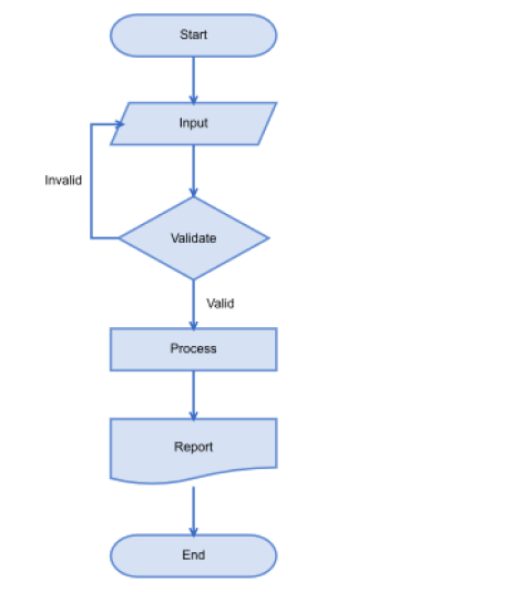
The purpose of a flow chart is to provide people with a common language or reference point when dealing with a project or process.
- Thinking
- Seeing
- Doing
- Feeling
Let's divide the population on the basis of age 0–18 Yr - 30% of 20 Mn = 6 Mn -> We can neglect this age group because generally, they don't need a personal laptop and when needed, they prefer to use others laptop.
19–22 Yr - 10% of 20 Mn = 2Mn -> 0.6*2 Mn -> 1.2 Mn (This is the college-age group. Most of the college students need a laptop. Assumed 60% of them own a laptop)
22–50 Yr = 40% of 20 Mn = 8 Mn. 22-50 age group is the working class of society. I have divided this class into 3 major categories. White-collar employees (25%)
Blue-collar employees (50%)
Small business owners (25%)
Assumed 80% and 30% people in the category of white-collar employees and Small business owners respectively own a laptop or PC. We can neglect blue-collar employees.
80% white collar own a laptop or PC -> 1.6 Mn
Small business owners own laptops or PC -> 0.6 Mn
50–80 Yr = 20% = 4 Mn -> we can ignore this age group
Total laptop + PC users in Bangalore = 1.2+1.6+.6= 2.4 Mn
Corporate offices/Schools/Computer centers generally have desktop. Lets assume 60% are desktops. Laptops = 40% -> 0.9 Mn
Average life of a laptop = 5 year ( in India ) Number of sold per day in Bangalore = 0.9 Mn/ 365*5 ~ 500 laptops
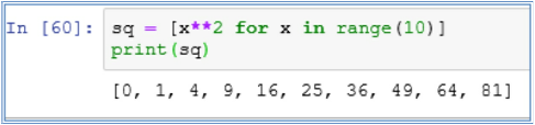
print(sq)
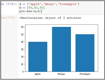
a = ['Apple','Mango','Pineapple']
b = [40,60,50]
plt.bar(a,b)
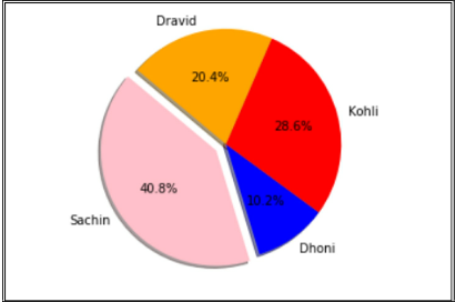
size = [100,25,70,50]
colors = ['pink','blue','red','orange']
explode = (0.1,0,0,0)
plt.pie(size,explode=explode,labels=labels,colors=colors,autopct='%1.1f%%',shadow=True,startangle=140)
plt.axis('equal')
plt.show()
So, we can safely assume that ARIMAX is the sum of ARIMA and Linear Regression.
There were few more questions on the basics of Statistics, you can easily find the answers to these questions on the internet, the reason behind not answering these 4 questions is that Amazon does not allow us to share knowledge which is easily available on the internet:-
Shallow Copy: To create a shallow copy we call copy.copy(x). In a shallow copy, Python creates a new compound object based on the original object. And it tries to put references from the original object into copy object.
Deep Copy: To create a deep copy, we call copy.deepcopy(x). In a deep copy, Python creates a new object and recursively creates and inserts copies of the objects from original object into copy object. In a deep copy, we may face the issue of recursive loop due to infinite recursion.
Wherever we need a function, we can also use a lambda expression.
We have to use lambda keyword for creating a lambda expression. Syntax of lambda function is as follows:
lambda argumentList: expression
E.g. lambda a,b: a+b
The above-mentioned lambda expression takes two arguments and returns their sum. We can use lambda expression to return a function.
A lambda expression can be used to pass a function as an argument in another function.
Python provides another function xrange() that is similar to range() but xrange() returns a sequence object instead of list object. In xrange() all the values are not stored simultaneously in memory. It is a lazy loading based function.
But as per Python documentation, the benefit of xrange() over range() is very minimal in regular scenarios.
As of version 3.1, xrange is deprecated.
These are also known as System-defined names.
Some of the important functions are
Object._new_
Object._init_
Object._del_
A Generator is more compact than an Iterator due to the fact that _iter_() and next() functions are automatically created in a Generator.
Also within a Generator code, local variables and execution state is saved between multiple calls. Therefore, there is no need to add extra variables like self.index, etc to keep track of iteration.
Generator also increases the readability of the code written in Python. It is a very simple implementation of an Iterator.
In Python, Iterator object provides _iter_() and next() methods.
In Python, an Iterable object has _iter_ function that returns an Iterator object.
When we work on a map or a for loop in Python, we can use next() method to get an Iterable item from the Iterator.
The syntax of Slicing is very convenient to use.
E.g. In following example, we are getting a substring out of the name John.
>>> name="John"
>>> name[1:3]
'oh'
In Slicing, we can give two indices in the String to create a Substring. If we do not give the first index, then it defaults to 0.
E.g.
>>> name="John"
>>> name[:2]
'Jo'
If we do not give second index, then it defaults to the size of the String.
>>> name="John"
>>> name[3:]
'n'
Some of the use cases for pass statement are as follows:
1.Syntax purpose:
>>> while True:
... pass # Wait till user input is received
2.Minimal Class: It can be used for creating minimal classes:
>>> class MyMinimalClass:
... pass
3.Place-holder for TODO work: We can also use it as a placeholder for TODO work on a function or code that needs to be implemented at a later point of time.
>>> def initialization():
... pass # TODO
1. use + operator:
E.g.
>>> fname="John"
>>> lname="Ray"
>>> print fname+lname
JohnRay 2. use join function:
E.g.
>>> ''.join(['John','Ray'])
'JohnRay'
E.g. the set of built-in exception names, the set of built-in names, local names in a function
At different moments in Python, different Namespaces are created. Each Namespace in Python can have a different lifetime.
For the list of built-in names, Namespace is created when Python interpreter starts.
When Python interpreter reads the definition of a module, it creates a global namespace for that module.
When Python interpreter calls a function, it creates a local namespace for that function.
Numeric types: These are the data types used to represent numbers in Python.
int: It is used for Integers
long: It is used for very large integers of non-limited length.
float: It is used for decimal numbers.
complex: This one is for representing complex numbers
Sequence types: These data types are used to represent a sequence of characters or objects.
str: This is similar to String in Java. It can represent a sequence of characters.
bytes: This is a sequence of integers in the range of 0-255.
byte array: like bytes, but mutable (see below); only available in Python 3.x
list: This is a sequence of objects.
tuple: This is a sequence of immutable objects.
Sets: These are unordered collections.
set: This is a collection of unique objects.
frozen set: This is a collection of unique immutable objects.
Mappings: This is similar to a Map in Java.
dict: This is also called hashmap. It has key-value pair to store information by using hashing.
Main differences between List and Dictionary data types in Python are as follows:
1. Syntax: In a List, we store objects in a sequence. In a Dictionary, we store objects in key-value pairs.
2. Reference: In List, we access objects by index number. It starts at 0 indexes. In a Dictionary we access objects by key specified at the time of Dictionary creation.
3. Ordering: In a List, objects are stored in an ordered sequence. In a Dictionary objects are not stored in an ordered sequence.
4.Hashing: In a Dictionary, keys have to be hashable. In a List, there is no need for hashing.
print(“Good Salary”)
elif salary<20000
print(“Average Salary”)
else
print(“Salary is 20000”)
| EmpNo | EName | Job | MGR | HireDate | Sal | Comm | DeptNo |
| 1234 | Amit | Waiter | 8382 | 19-Oct-18 | 50000 | 500 | 50 |
| 5678 | Ashish | Analyst | 8635 | 2-Nov-18 | 60000 | 200 | 51 |
FROM emp
WHERE sal > (SELECT sal FROM emp WHERE EName = ‘Aman’);
| EmpNo | EName | Job | MGR | HireDate | Sal | Comm | DeptNo |
| 1234 | Amit | Waiter | 8382 | 19-Oct-18 | 50000 | 500 | 50 |
| 5678 | Ashish | Analyst | 8635 | 2-Nov-18 | 60000 | 200 | 51 |
FROM emp w, emp m
WHERE w.MGR = m.EmpNo and w.HireDate < m.HireDate
Or
SELECT *
FROM emp w, emp m
WHERE w.EmpNo = m.MGR and w.HireDate < m.HireDate
a) Date and Day of order
b) Time of order
c) Phone number
d) Pin code
To avoid this issue we use the least-squares GAN. In the least-squares GAN, although the fake samples generated by the generator are on the correct side of the decision surface, gradients will not vanish until the fake samples match the true distribution.
First, we take the image and feed the image as an input to the discriminator, then the discriminator performs a series of convolution operation and then classifies whether the image is a fake image generated by the generator or the image is a real image from the training data.
First, we draw a noise from a normal distribution and feed that as an input to the generator. The generator which is composed of convolutional transpose and batch norm layers takes this noise as an input and generates an image similar to the ones present in the training set.
The generative models can also classify the data points, however, instead of learning the decision boundary, they learn the characteristics of each of the classes.
In the first stage, they generate a basic outline, primitive shapes, and create a low-resolution version of the image.
In the second stage, they enhance the picture generated in the first stage by making it more realistic and then convert them into a high-resolution image.
So, to avoid this issue, we can use the Wasserstein GAN which uses the Wasserstein distance instead of JS divergence.
Similarly, instead of using vanilla GAN, we can use DCGAN whose generator and discriminator involve the convnets instead of the feed-forward networks. The DCGAN is very effective at tasks related to the images than the vanilla GANs.
Since the generator network implicitly learns the distribution of the training set, GANs are often called the implicit density model.
Classification: We can use supervised learning to determine classes in data. We can predict the class of a data point based on the features of data.
Speech recognition: Supervised learning is used in speech recognition to understand human speech by computers. This is also used in translating speech to text as well as in translating text from one language to another language.
Regression: In Regression, we can determine the value of a dependent variable based on the values of independent variables. Eg. Finding the price of a house based on its sq. ft. and other features by using linear regression.
Marketing: We can use supervised learning to find the lifetime value of a customer in customer analytics.
As per the NB algorithm, the classifier assumes that all the features used for prediction are independent of each other.
E.g. fruit can be predicted as an orange based on its weight, height, and color. NB algorithm does not try to find any relationship between these features. It uses all the three features independently to determine that this fruit is orange.
NB algorithm is very easy to build. It is very useful for large data sets.
NB is considered one of the most significant and reliable algorithms of classification.
Simple: NB is very simple to implement. It just needs calculation of the probability of each feature and then it uses all these probabilities to determine the class of a data point.
Large Dataset: NB can be used on very large data sets. Since NB is simple to use, it requires very little computation power compared to other complex algorithms.
Performance: Compared to other complex models, NB provides a very reliable classification.
Training Data: NB requires less training data compared to other algorithms.
-
- Data mining
-
- Speech recognition
-
- Statistical analysis
-
- Computer vision
- Bio-informatics
We can create these models to solve a problem. But these models provide different results.
We evaluate the performance of a model based on these results. The criteria for these results can be accuracy, precision, recall, or any other derived score.
In certain cases, precision is more important. E.g. In the case of user experience, we emphasize precision.
In certain cases recall is more important. E.g. In the case of disease detection, it is better to pick a model with less precision but a lower false-negative rate.
Cross-validation: We can divide initial data into multiple mini test-train data splits. These mini splits can be used for tuning the model as per requirements. We can use k-fold cross-validation.
Gather More Training Data: We can use more training data to tune the model. If data is not available, we can find ways to gather more data.
Data Augmentation and Noise: If it is not possible to gather more training data, we can augment existing data to make it appear more diverse. It makes the model less prone to overfitting.
Model Simplification: We can simplify the model to use less features. This can lead to a model simple enough to not overfit and make it good enough to learn from data.
Regularization: We can use regularization technique to prevent overfitting. We can tune the values of L1 and L2 weights to make the model more general.
This technique discourages Machine learning to form a complex model to avoid overfitting.
We can use Ridge regression or Lasso regression techniques for tuning the Regularization parameter.
With Regularization the amount of variance in the model is reduced. Whereas bias in the model remains unaffected by Regularization.
In a simple Linear regression equation of y = aX + b, b is bias.
It is a simple linear classifier. It uses a linear function to make a prediction about the class of a data set.
In its simplest form it follows following formula:
y = aX + b
If aX b > 0 then class is 1 else class is 0.
Since Perceptron is a linear classifier, it works well when classes can be separated by a straight line.
Platt Calibration: In Platt calibration, we transform the outputs of a classification model into a probability distribution over classes. In binary classification, we distribute data over two classes. But sometimes we need prediction about class as well as the probability of certainty about the prediction. By using Platt calibration we can get the probability estimate. It means we get how sure we are of our classification being correct.
Isotonic Regression: It is also known as monotonic regression. We use Isotonic regression to calibrate the linearity imposed by linear regression. In Isotonic regression, we fit an isotonic curve to means of an experimental result. Isotonic regression is not constrained by any concrete form like a linear function in linear regression.
Binary classification: We can use SVM to create a binary classifier. In SVM, we can find the hyperplane to divide data into two distinct classes.
Multi-class classification: SVM algorithm works well to divide data into multiple classes. In this case, we have to determine multiple hyperplanes that separate the classes. In certain cases classes are not distinguished by a linear function. We can use kernel trick to transform low dimensional input space to higher-order dimensional space. E.g. we can use circle form to distinguish classes.
Pros:
- Clear: SVM provides a clear separation of data into classes. It works well and provides clear margin of separation between classes.
- High dimension: SVM is effective in classifying data in high dimensional space.
- Number of dimension: SVM can effectively classify data that has more number of dimensions than the number of samples.
- Memory: SVM uses a subset of training points in support vectors (decision function). Therefore it is an efficient algorithm from memory perspective.
- Cons:
- Low performance: SVM has low performance on a large data set, because it requires more training time to calculate and identify support vectors.
- Noise: SVM cannot perform well when classes are not distinct. High amount of noise or overlapping classes bring down the accuracy of SVM classification.
- Probability: We don’t get probability estimates with SVM.
Ensemble learning is a form of supervised learning. We try multiple algorithms and combine their results to get the level of performance acceptable for our problem.
In general, we get better performance from ensemble learning when diverse models are used. Therefore, certain ensemble methods promote the use of diverse models in learning.
Bayes optimal classifier
Bootstrap aggregating (bagging)
Boosting
Bayesian parameter averaging
Bayesian model combination
Bucket of models
Stacking
It is a learning algorithm that combines the results of other algorithms to give a better predictive performance.
First we use different types of learning algorithms on original data for prediction. Then we create a combiner algorithm that provides final prediction by using the prediction results of algorithms used in the first step.
One variation of stacking is known as blending. It was used in a famous Netflix prediction competition.
In general, stacking gives better performance than Bayesian model averaging.
Sequential ensemble: In this paradigm, we use multiple models in a sequence. The prediction output of one model is used as an input for the next model.
Parallel ensemble: In this paradigm, multiple models are used in parallel. The prediction results from these models are combined to give the final output of the ensemble model.
Bagging: Bagging is also known as Bootstrap aggregating. In bagging, we reduce the variance of the model by generating additional test data. Once the size of the data set is increased, we can tune the model to be more immune to variance.
Boosting: Boosting is a two-step algorithm for ensemble learning. In boosting, we use subsets of a dataset to create an average performance model. Then we tune the model on larger data set to boost the performance of the model.
Data partition: In bagging data partition is random. In boosting, miss-classified data is given higher importance.
Goal: In bagging the goal is to reduce the variance in the model. Boosting aims for increasing the prediction accuracy of the model.
Method: We use a random subspace in bagging. Boosting uses a gradient descent method.
Function: Bagging uses the weighted or average function. Boosting uses a weighted majority vote function.
KPCA stands for Kernel-based Principal Component Analysis.
ICA stands for Independent Component Analysis.
These are feature extraction techniques used in machine learning.
The primary purpose of PCA, KPCA, and ICA is dimensionality reduction.
In this algorithm, input data is continuously used to further train the model. It is a dynamic technique of machine learning.
Some of the examples of incremental learning algorithms are decision trees, artificial neural networks, and incremental SVM.
The goal of Incremental learning is to adapt the model to new data while maintaining the knowledge learned earlier.
Incremental learning is very popular in data streams of Big data.
with dimension reduction we aim to find the important features that can be used for prediction.
dimension reduction process reduces the number of random variables or features under consideration in a machine learning algorithm.
some of the advantages of dimension reduction (DR) are as follows:
a) DR reduces the need for storage and time to perform a machine learning algorithm. it makes the algorithm more efficient.
b) DR removes the multi-collinearity between features. it can improve the performance of the model.
c)DR dr makes it easy to visualize the model in 2d or 3d views.
Machine learning also helps us in understanding more about different data sets. Sometimes, we use machine learning to create segments of different groups in a dataset.
We can also use it to predict trends based on existing data.
One popular use of Machine learning is to predict user behavior based on different models and past user behavior information.
Some of the examples of Machine Learning use cases are:
- Email/Spam filtering
- Network intrusion detection
- Optical Character Recognition (OCR)
- Ranking Data
- Fraudulent Financial Transactions Detection
- Image Recognition
We perform data mining by using programming methods and algorithms. We can use it to extract useful information from a large amount of raw data. It helps us in making the data understandable and usable.
Machine Learning is a technique to make the computer learn new things without explicitly programming. It is based on pattern recognition, computational learning theory, and artificial intelligence.
Some of the main uses of Machine Learning are predictive analysis and classification.
The important difference here is that in Data mining, we explicitly look for patterns, whereas in Machine learning our algorithm/model identifies the patterns.
In simple words, we try to learn by example. We generalize the samples and estimate the output.
E.g. Let say we want to classify two types of fruits: apple and watermelon. We can measure the height and weight of these fruits in our test data set and label these as apple or watermelon.
Then we give it to our model. Our model can start approximating that things of higher weight and more height are watermelons and lesser weight things are apples. This is an example of inductive learning.
In deductive learning, we learn by actual experiment. We look at these fruits and conclude that watermelons are heavier than apples. Now we apply this rule to our data to deduce that this is a lighter object, therefore it is an apple.
Generally for Disease diagnosis, we use Inductive machine learning. Based on certain symptoms, a model can predict if the disease is present or not.
a. Model Building: We use different algorithms to build a model. In this stage, we use training data to build a model.
b. Model testing: In this stage, the model is tested by providing sample test data. We can determine the accuracy of the model in this stage. If the model meets our accuracy criteria on test data, we can use it for actual production purposes.
c. Applying the model: Once the model starts working correctly, we apply the model to real data and start using it. We keep on calculating the accuracy of real data to keep the model updated. In case of any drop in accuracy we go back to the model building stage and tune the model.
a. Supervised Learning: In this learning technique we infer a function from a labeled training data. There are a set of examples with input and output. Based on that we try to come up with a model/function to predict future data. An example of supervised learning is the Decision tree.
b. Unsupervised Learning: In Unsupervised learning, we infer a function from unlabeled data. Two common approaches of unsupervised learning are Self-Organizing Map (SOM) and Adaptive Resonance Theory (ART).
c. Semi-supervised Learning: It is a supervised learning type in which we also make use of unsupervised learning approach. We can use labeled as well as unlabeled data in this technique. It is a general opinion that unlabeled data in conjunction with labeled data can improve the accuracy of model.
d. Reinforcement Learning: In Reinforcement learning the basis is behavioral psychology. Software agents are programmed to take actions to maximize the cumulative reward. This concept is also used in Game Theory, Operations Research, and Control Theory.
e. Transduction Learning: It is a Supervised learning approach in which reasoning is from general cases to specific cases. It is preferred over induction. In transduction, we try to get the answers that we need rather than creating general rules.
f. Learning to Learn: It is also known as Meta Learning. In this approach, the learning technique is flexible enough to keep making modifications in the algorithm to learn new scenarios.
We start with data x and output of function f(x). The proposed model is run on the training dataset first. Once the model is mature, we use the test dataset for testing it. When we are at a desired level of accuracy, we can use the model on real data.
Some of the popular algorithms of supervised learning are:
Support Vector Machines
Linear Regression
Logistic Regression
Naive Bayes
Decision Tree
K Nearest Neighbor
E.g. Let say we have a list of emails. The size and content of these emails vary. When we provide these emails to our classifier model, it can classify these as spam or non-spam classes.
A classifier is a supervised learning approach. Initially, we know the distinct classes of data. Then we build a model to predict the class for a set of input data.
Classifiers are very useful in spam identifications, disease identification, etc.
-Tableau desktop is used for creating visualizations such as charts, tables, and Maps.
-Users can connect to any data source. If multiple tables are used, then these tables can be joined. Data Sources can be named and shared.
-When the data source is created, depending on the data type, Tableau automatically segregates data into measures and dimensions. Data elements can be transformed.
-These data elements are used to create charts, tables, and Maps by simple drag-and-drop of data elements into the development area.
-One visualization is created per “worksheet”. Multiple worksheets make one “dashboard”.
-If the user needs a “story”, worksheets and dashboards can be used to create a story.
- Worksheet, Dashboards, and Story is created by clicking on the icons at the bottom of the screen
or by using the menu options

The folder contains all the files required by Tableau
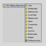
• Logs, the folder contains all the issue logs.
• Workbooks contain all the workbooks – twb and twbx files. Save all your workbooks in this folder.
• Datasources, this folder is used to keep all the data source files such as csv, excel, etc.
• Local Data, when custom geocoding is imported, it gets stored in this folder.
• Map sources, Tableau Map Source (.tms) file is stored in this folder.
• Bookmarks, with .tbm file extension, are stored in this folder.
• Shapes, this folder contains all the shapes provided by Tableau. To add your custom shapes, copy custom shapes in an image format and add to a new folder under this folder.
• Preference.tps, the file is used to add custom color palettes.
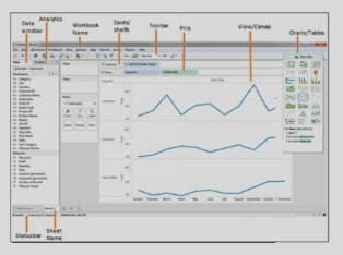
1. Data window. Displays information about the data connection and fields in the data source.
2. Analytics. Contains ready-to-use objects for faster analysis of data.
3. Workbook Name. The workbook consists of data connection, worksheet, dashboard, stories, and images. Worksheet name has an extension of .twb. If it is a packaged workbook then the extension is .twbx.
4. Cards/shelves. Views are created by placing fields on the cards or shelves. Mark cards have different shelves such as color, size, label, detail, tooltip. Fields can be placed on these shelves. Changing the Mark type like Automatic, Shape will change these shelves.
5. Toolbar. The toolbar provides quick access to different functionalities such as undo/redo, adding sheets, sorting, displaying labels, and so on.
6. Pills. Fields or calculations on the rows or columns are called Pills. Click on a pill to access pull-down menu options such as filter, Table calculations, etc. The dimension pill is blue in color and Measure pill is green.
7. View/Canvas. This space displays visualization created by the fields placed on the shelves.
8. Filters. A filter shelf is used to place filters that limit the data.
9. Pages. This shelf displays views on different pages. If a dimension is placed on Pages, it creates separate pages for each dimension. If a measure is used, then measure is converted to discreet measure.
10. Show Me. Depending on the field selection in the data window, Tableau suggests the best-suited visualization. Different visualizations can be selected in the "Show Me” box.
11. Status bar. Displays various attributes of the visualization in the current worksheet. It displays information such as the number of Marks, the the number of rows and columns, and aggregated measures.
12. Sheet Name. Displays the name of the current worksheet. Give meaningful names to the sheets, if multiple sheets are created. There are three types of sheets - worksheet, dashboards, and story.
Exercise: Launch Tableau Desktop, connect to data source Sample – Superstore.xls under \Documents\My Tableau Repository\Datasources\. Use Orders datasheet as the source data. Refer to downloaded workbook – Tableau_QA_SolutionsWorkBook.twbx.
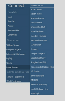
- Requirement gathering. Discussion with users to understand their data and visualization requirements.
- Analyze data sources. Gather information on different data sources and relationships among the data elements.
- Create mockups of the dashboards. User review of mockups.
- Create a data source.
- Structure the data by renaming data fields to user-friendly columns. As required, create calculated fields, hierarchies, parameters, and other elements.
- Depending on the number of data elements in the data source, organize data into different folders.
- worksheets and dashboards as per the requirement.
- Unit Testing. Comparing the data in the visualizations with the source data. Review of a dashboard by the users.
- If the server option is available and desired deploy dashboards over the Server.
- Create data load schedules.
The fact table contains a measurable attribute of the data. For example, the Fact table can contain Sales Amount or the Sales made to a Customer. The fact table contains the foreign key of the Dimension Table.
Dimension provides context to a Fact. Without Dimension Fact will not be meaning full.
In the above example, Customer Info will be stored in the Customer Dimension, and Sales made to different customers will be stored in the Fact table. These two tables will be joined to get the Sales Amount of a Customer.
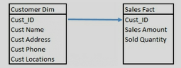
2) The dimension contains the textual/ descriptive attribute and Fact contains the measurable data. Look for such data elements in the tables.
3) The fact table contains the foreign key of the dimension table.
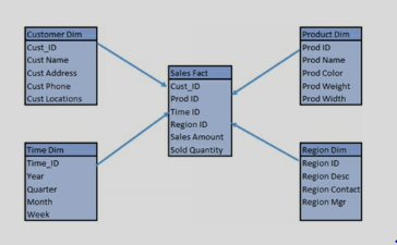
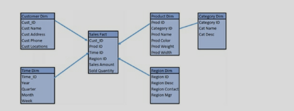
- -Take data requirements. Data sources, key filters, data refresh frequency.
- -Ask users about the KPI (Key Performance Indicators).
- -Inquire about the questions users are trying to answer.
- -Document business rules required for the dashboards.
- -Understand security requirements.
- -Gather details about any existing reports or desired visualization.
- -Provide layout of the screen in terms of a dashboard- charts, and tables in excel or hand-drawn. Get the user's feedback on the layout.
- -Get requirements about the screen resolution.
We use FP to transform the data from high dimension space to space with fewer dimensions. Some of the techniques of FP are as follows:
Principal component analysis (PCA): PCA performs a linear mapping of data from higher to lower dimensions.
Non negative matrix factorization (NMF): NMF decomposes a non-negative matrix to product of two non-negative ones.
Kernel PCA: In this technique PCA can be done by using kernel trick. It is used for constructing non-linear mappings.
Autoencoder: We use autoencoder to learn non-linear dimension reduction functions. We use inverse functions in this technique to create original representation from coding.
SVM is used for classification and regression problems. It is mostly used in classification analysis to divide the dataset into multiple classes.
In SVM we try to identify the hyperplane by which data can be divided into classes. Then we try to maximize the distance between classes so that data can distinctly be labeled. This distance is called the margin.
Most of the time we get a linear classification in SVM. But sometimes we have to deal with non-linear classification. In such a scenario we can use kernel trick. The kernel trick takes low dimensional input space and takes it to higher-dimensional space.
Variance in machine learning comes from high complexity in an algorithm. Due to variance, the model becomes sensitive to variation in data. Variance causes the inclusion of noise in the model. This leads to over fitting of data.
Therefore in machine learning, we have to balance the bias and variance so that model provides prediction with optimum accuracy. We do not want a high bias or high variance in our model.
It is an art to maintain a balance between bias and variance while creating a machine-learning model.
We need labeled data in the KNN algorithm. In K-means clustering we need unlabeled points and a threshold. The algorithm takes unlabeled points and clusters them into groups by calculating the mean distance between the points.
Let say we have a dataset of 12 fruits, apples, and oranges. Our model identifies 8 apples out of these. Out of these 5 apples are actually apples. This is called true positives. These rest 3 apples identified by the model are called false positives. In this case, the precision of the model is 5/8.
Precision tells us how effective is our model in identifying the true positives.
The other way of looking at precision is how useful the prediction is.
Precision is a measure of quality or exactness of results.
Let say we have a dataset of 12 fruits, apples, and oranges. Our model identifies 8 apples out of these. Out of these 5 apples are actually apples. This is called true positives. These rest 3 apples identified by the model are called false positives. In this case, the recall of the model is 5/12.
The other way of looking at recall is how complete the results are.
Recall is a measure of quantity or completeness of results.
Recall can also be used to find the probability that a relevant result is predicted by model.
Bayes’ theorem is a mathematical theorem about probability. We can calculate the probability of an event if we know the probability of events prior to it.
The formula of Bayes’ theorem is:
P(A/B) = ( P(B/A) * P(A) ) / P(B)
Here A and B are events and P(B) is not equal to zero.
Due to the simple use of Bayes’ theorem, the Naive Bayes classifier is simple and highly scalable. It just requires parameters in a linear manner. Some of the variations of
Naive Bayes theorem are:
Gaussian Naive Bayes, Multinomial Naive Bayes, and Bernoulli Naive Bayes.
L1 regression is known as Lasso regression. L2 regression is known as Ridge regression.
Both of these techniques impose a penalty on coefficients to minimize overfitting.
L1 regularization is based on a sparse approach. L1 shrinks some coefficients to 0 value. This minimizes the impact of such features in the model. L2 regularization tries to spread the error among all the terms.
If we have data with correlated features, L2 regression works better. If only some features in data are related to prediction then L1 regression gives better results.
Type I and Type II errors are used in machine learning to find the effectiveness of the hypothesis. These are the concepts derived from statistics.
Type I Error: Type I error is the rejection of the null hypothesis. It is also known as a false positive. It means the result indicates that a condition is present but it is not present. E.g. If a test predicts that a person has diabetes, but in reality, the person does not have diabetes. It is an example of a Type I error.
Type II Error: Type II error is the failure to reject the null hypothesis. It is also known as a false negative. It means, the result indicates that a condition is not present, but it is actually present. E.g. If a test predicts that a person does not have diabetes, but in reality the person has diabetes. It is an example of a Type II error.
In machine learning, we have to establish the acceptance criteria of a model on the basis of acceptable false-positive and false-negative results. Therefore, Type I and Type II errors are quite useful in machine learning models.
It is also known as Deep structured learning or hierarchical learning.
The main inspiration behind deep learning is information processing and communication patterns in the biological nervous system.
Artificial Neural networks and Deep neural networks are two popular techniques of deep learning.
Some of the most popular uses of Deep learning are speech recognition, image recognition, natural language processing, etc.
One potential response is something along the lines of, “First, I prioritize the changes to requirements, the scope of changes and the impact analysis to the project. Next, I perform an impact analysis of the project cost, timeline, and resources. Finally, I evaluate whether the scope change is introducing new gaps to the technical or functional designs or development and testing.”
1)Market Analysis
2)Competitor Analysis
3)SWOT Analysis
4)Strategic Vision and Feature Set
5) Prioritize Features
6) Use Cases
7)Storyboards
8)Test Cases
10) Monitoring Scalability.
These topics are dealt in detail further. This is not the only series of steps, but now you do have a prototype to keep in mind and you can build your own content.
Who are you selling to?
Define your target customer or market. Identify whom you are selling to, and what that market looks like.
What are you selling?
how potential customers will perceive your product compared to competitive products. Understand what makes your product unique in the market.
What value do you provide your customers?
Determine what problems your product solves for customers. You cannot be everything to everyone within a particular market, but you can help to solve specific problems. Create a value proposition to position the value you provide and the benefits that customers will receive with your solution.
How will you price your product?
State how you will price the product. Include its perceived value and a pricing model.
How will you distribute your product?
how you will sell your product, and how your target market will acquire your product.
Thinking and feeling – This section deals with getting in the shoes of the customer and to know what they really want, think and feel for the product. What are their hopes, dreams, and fears?
Hearing – It maps all the things which the customer hears from different sources e.g. Social Media, Print Media, Customer feedback, etc. Basically what influences the customer!
Seeing – It looks after what the customer looks at? Everything including her environment, friends, and what the market offers. Pains – The problems felt by the customer in order to purchase a product or receive a service from the company. It could be anything between the problem in logging in to the website to bad service from the company’s side.
Gain– Now the main part i.e. the customer’s expectation from the company and the product.
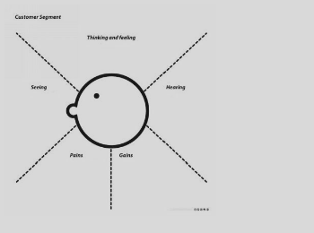
So this map helps you get all the required information about the customer and his views.
- Fraud Analytics
- Market Analysis
- Customer Retention
- Product Control
1. Scalability – The method should be able to scale in order to handle a large set of data.
2. Able to handle different data types
3. Able to deal with outliers and noise
4. Usability
5. Insensitive to the order of input records
-It is used to derive a significant relationship between variables
-Regression analysis also allows us to compare the effects of variables measured on different scales, such as the effect of price changes and the number of promotional activities.
a)You have the pin code so you can try to find the pattern and see if there are some food items that are delivered in a particular area. For eg. If there is a Bengali colony and fish items are being sold a lot, so you can recommend food items
b) Day can get you the food items which are more popular during weekends
c) Time of order can get you the most popular food of the hour, you can give some discount on these items or make in bulk d) Phone number to inform about new offers(Not a finding)
An “under differenced” series has an AR signature (positive autocorrelation) After one or more orders of differencing, the autocorrelation will become more negative and an MA signature will emerge
Don’t go too far: if series already has zero or negative autocorrelation at lag 1, don’t difference again.
1-Shelf life of model (For how long is the product good to use)
2-Nature of data
3. Nature of business
4-expected accuracy

a) Activities
b) Association
c) Conditions
d) Constraints
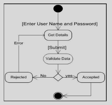
Step 2: Create at least one measurable outcome for each focus area.
Within each focus area, what does success look like?
Design Pathfinder Projects with milestones.
To reach your outcome you will need at least one project. We call these "Pathfinder Projects" because, in truth, you don't know what will work. Just like outcomes, though, you need to be crystal clear in defining a Pathfinder Project.
The best way to get clarity is by setting commonsense milestones. That way, you can tell if your project is getting off course, or worse yet, not working at all. Your milestones alert you to failure. When you fail early, you fail cheaply...and you learn.
Draft a short Strategic Action Plan.
Commit to a 30-day review process
1. Problem definition
2. Data Exploration
3. Data Preparation –
4. Modeling
5. Validation
6. Implementation and tracking
If no pattern, then we can either ignore missing values (SAS will not use any observation with missing data) or impute the missing values. Simple imputation – substituted with mean or median values.
a. Concordance – This tells you about the ability of the model to discriminate between the event happening and not happening.
b. Lift – It helps you assess how much better the model is compared to random selection.
c. Classification matrix – helps you look at the false positives and true negatives.
Some other general questions you will most likely be asked:
- What have you done to improve your data analytics knowledge in the past year?
- What are your career goals?
- Why do you want a career in data analytics?
The answers to these questions will have to be unique to the person answering it. The key is to show confidence and give well thought out answers that demonstrate you are knowledgeable about the industry and have the conviction to work hard and excel as a data analyst.
Your marker would also look at the quality and reasonableness of your recommendations. Reasonableness includes that the recommendations could be achieved taking account of resources such as time and money. There are often many solutions to a problem but giving all possible solutions loses marks in a case study situation because it is considered unrealistic.
Your course description of the task should contain guidelines on the types of questions to ask when analyzing the case along with other issues/possibilities to consider in your analysis and discussion.
Specific: The requirement should be specific so that it could be properly documented
Measurable: We should be able to measure the success criteria of the requirement by different parameters
Attainable: The requirement should be possible to attain with the given resources
Relevant: The requirement should be in line with the project’s business case
Timely: The requirement should be posed in time i.e. early in the project life cycle.
1) Capture both functional and non-functional requirements in a use case.
2) Include use case diagrams along with the use case.
3) Include the UI details/notes in the use case.
The job description should provide clues as to what types of skills the employer is looking for on both fronts — especially technical requirements. Learning what you can about the company culture prior to the interview can also provide insight into interpersonal abilities that will likely be valued.
1) Delphi Technique – This technique involves questioning, compilation, and re-questioning until the company reaches a conclusion. The panel of experts are made to prepare some question and they are asked to answer these questions, the answers are then evaluated. After this, the questions are re asked to the panel. This process is carried on in an infinite loop until and unless a conclusion is reached.
2) Subjective approach – The subjective approach uses a lot of brainstorming approaches by the core members along with employees to generate ideas and solve problems of the company. This prediction is done based on subjective thoughts and feelings
3) Time Series Forecasting – It is a quantitative technique and it involves looking for trends in the business by crunching data on hourly, daily, weekly, monthly, yearly, or longer periods. The increase in cold drink sales in the festive season in India is an example of a seasonal event.
4) Scenario Writing - In Scenario Writing, the forecaster generates different outcomes based on different starting criteria. The decision-maker then decides on the most likely outcome from the numerous scenarios presented. Scenario writing typically yields the best, worst, and middle option.
- A/B Test
- Student’sT Test
- Chi-square Test
- Fisher’s Exact Test
- Mann-Whitney Test
1. Data Cleaning – Clean the data and remove noise and inconsistency
2. Data Integration – Combine multiple data source
3. Data Selection – Relevant data is retrieved from the data set
4. Data Transformation – Data is transformed in a useable format to solve the problem statement
5. Data Mining – Intelligent methods are applied in order to extract data pattern
6. Pattern Evaluation – Data patterns are evaluated
7. Knowledge Presentation – Showcase the evaluated pattern
1. Distribution Based Clustering
2. Density-Based Clustering
3. Connectivity Based Clustering
4. Centroid Based Clustering (K-Mean)
-a processing step, usually called activity and denoted as a rectangular box
-a decision usually denoted as a diamond.
I – Independent ( The product should be independent/minimum dependent on other products)
N – Negotiable(The product should not be fixed, it can be rewritten or even discarded, depending on the business, market, technical, or any other type of requirement by team members.)
V – Valuable(bring actual project-related value to the end-user and continuously deliver a quality product to the users)
E – Estimable (Product need to be estimable in order to plan its flow, iterate )
S – Sized Appropriately (The size of the product should suit the environment of production i.e. number of resources, the technology required, etc.)
T – Testable (The product/service should be testable in order to reiterate ).
Case studies are analyses of persons, events, decisions, periods, projects, policies, institutions, or other systems that are studied holistically by one or more methods. The case that is the subject of the inquiry will be an instance of a class of phenomena that provides an analytical frame — an object — within which the study is conducted and which the case illuminates and explicates
-> Case study/Analysis is the basic requirement to crack any BA interview
Red chilly restaurant is a Giant food chain in Bangalore with delivery and dinning. They are earning good but they want more ( greedy !!). They have heard a lot about data scientists, so they hired one. The restaurant had been collecting data on its service for the last 10 years. The data they had was too little but clean. We managed to get a glance on the data set
-Name
-Sex
-Food item code
-Pin code
You being the new recruiter have to answer a few questions and make a recommendation engine to recommend 2 food items to a person new to the restaurant.
a. What is there in the data – look at the list of all the variables in the data set. Understand the meaning of each variable using the data dictionary. Go back to the business for more information in case of any confusion.
b. How much data is there – look at the volume of the data (how many records), look at the time frame of the data (last 3 months, last 6 months, etc.)
c. Quality of the data – how much missing information, quality of data in each variable. Are all fields usable? If a field has data for only 10% of the observations, then maybe that field is not usable, etc.
d. You will also identify some important variables and may do a deeper investigation of these. Like looking at averages, min and max values, maybe 10th and 90th percentile as well.
e. You may also identify fields that you need to transform into the data prep stage.
But some things are done in most cases – for example, identifying missing values and treating them, identifying outlier values (unusual values) and treating them, transforming variables, creating binary variables if required, etc.
This is the stage where you will partition the data as well i.e. create training data (to do modeling) and validation (to do validation).
a) Autoregression (p) Order of the autoregressive model
b)Integration(d) degree of differencing
c)Moving Average(q) order of Moving Average Model
Big data is a term that describes the large volume of data – both structured and unstructured – that inundates a business on a day-to-day basis. But it's not the amount of data that's important. It's what organizations do with the data that matters.
A database management system (DBMS) is a computer program (or more typically, a suite of them) designed to manage a database, a large set of structured data, and run operations on the data requested by numerous users.
You can name a few DBMS if you have used it before. I had used MySQL, Microsoft Access, Teradata (For Big data), etc.
- -data governance
- -data architecture, analysis, and design
- -database management
- -data security management
- -data quality management reference and master
- -data management
- -data warehousing and business intelligence management
- -document, record, and content management
- -metadata management
- -contact data management
E.g. the Test Score of each student is data. The average score of the whole class is information.
The main idea is to define k centroids, one for each cluster. These centroids should be placed in a cunning way because of different location causes the different result. So, the better choice is to place them as much as possible far away from each other. The next step is to take each point belonging to a given data set and associate it to the nearest centroid.
When no point is pending, the first step is completed and an early grouping is done. At this point, we need to re-calculate k new centroids as the barycenter of the clusters resulting from the previous step. After we have these k new centroids, a new binding has to be done between the same data set points and the nearest new centroid. A loop has been generated.
As a result of this loop, we may notice that the k centroids change their location step by step until no more changes are done. In other words, centroids do not move anymore.
Y=ax+b
Y is response variable
X= Predictor variable
A and b are constants
y = 1/(1+e^-(a+b1x1+b2x2+b3x3+...)
Y=a1x1+a2x2+..+b
-Behavior Trees are a formal, graphical modeling language used primarily in systems and software engineering.
-A flowchart is a schematic representation of an algorithm or a stepwise process.
An error estimate is made for the cases which were not used while building the tree. That is called an OOB (Out-of-bag) error estimate which is mentioned as a percentage.
Y=aX+b
Linear regression (X is predictor variable and Y is response variable)
1)Strengths: characteristics of the business or project that give it an advantage over others
2)Weaknesses: characteristics that place the business or project at a disadvantage relative to others
3)Opportunities: elements that the business or project could exploit to its advantage
4)Threats: elements in the environment that could cause trouble for the business or project
Example - Comparison of analytical results obtained with the same method on samples A and B, in order to confirm whether both samples contain the same percentage of the measured analyte or not.
The outcome of these tests is the acceptance or rejection of the null hypothesis (H0). The null hypothesis generally states that: "Any differences, discrepancies, or suspiciously outlying results are purely due to random and not systematic errors". The alternative hypothesis (Ha) states exactly the opposite.
1. Problem Definition - This step is used to clear the definition for which data mining is to be done. Defining the problem is the most important part of the complete process. The whole data extraction and analysis depends on the data required. If you need to know which store is performing poorly in a locality then you need data on the store level.
2. Data Collection - The data is extracted from a humongous amount of data. The correct data need to be extracted from the raw data. It is then cleaned and sampled as well. Cleaning the data protects the analysis from exception handling.
3. Model Building - In this phase, you select and apply various modeling techniques and calibrate the parameters to optimal values. It is time to evaluate how well the model satisfies the originally-stated business goal (Stage 1)
4. Knowledge Deployment - Knowledge deployment is the use of data mining within a target environment. In the deployment phase, insight and actionable information can be derived from data.
-Big data is about data, plain and simple. Yes, you can add all sorts of adjectives when talking about “big” data, but at the end of the day, it’s all data.
-Internet of Things is about data, devices, and connectivity. Data – big and small – is front and center in the Internet of Things world of connected devices.
- good communicators
- problem-solvers,
- critical thinkers.
They can create requirements specifications, analyze requirements, create visual models, facilitate elicitation sessions, and use the necessary business analyst tools. The ability to ask the right question to understand the problem inside out is also an important skill to be a good problem solver.
-Discovery of Pattern
-Prediction of key outcomes
-Creation of actionable information(Data mining can derive actionable information from large volumes of data. For example, a town planner might use a model that predicts income based on demographics to develop a plan for low-income housing.)
<br.Propensity models are often used to identify those most likely to respond to an offer or to focus retention activity on those most likely to churn.
Time series analysis comprises methods for analyzing time-series data in order to extract meaningful statistics and other characteristics of the data. Time series forecasting is the use of a model to predict future values based on previously observed values.
Example – Rainfall in an area for a complete year, price of a stock in the stock market at different points of time in the day.
- Web analytics (hits, time on website)
- Retail( transaction history)
- Manufacturing (Completion time)
-Government (Tax collection)
-Graphical modeling languages use a diagram technique with named symbols that represent concepts and lines that connect the symbols and represent relationships and various other graphical notation to represent constraints.
-Textual modeling languages may use standardized keywords accompanied by parameters or natural language terms and phrases to make computer-interpretable expressions. An example of a graphical modeling language and a corresponding textual modeling language is EXPRESS.
a)Food item combination can help you recommend food items, suppose most of the people orders curd with Paratha, then you can recommend curd to a person who orders Paratha(:P).
b) A list of the most popular food item.
c) Looking at the customer’s age and sex you can decide what to offer to a new customer. If the data suggests that a girl in the age group 20-25 likes chocolate ice cream then you can recommend this ice cream to the new girl customer.
It is a very simple application framework that has many extensions to build an enterprise level application.
Flask does not provide a data abstraction layer or form validation by default. We can use external libraries on top of Flask to perform such tasks.
Easy to learn: Python is simple language. It is easy to learn for a new programmer.
Large library: There is a large library for utilities in Python that can be used for different kinds of applications.
Readability: Python has a variety of statements and expressions that are quite readable and very explicit in their use. It increases the readability of the overall code.
Memory management: In Python, memory management is built into the Interpreter. So a developer does not have to spend effort on managing memory among objects.
Complex built-in Data types: Python has built-in Complex data types like list, set, dict etc.
These data types give a very good performance as well as save time in coding new features.
Once we have set the values in a frozenset, we cannot change. So we cannot use and update methods from a set on frozenset.
Being hashable, we can use the objects in frozenset as keys in a Dictionary.
| EmpNo | EName | Job | MGR | HireDate | Sal | Comm | DeptNo |
| 1234 | Amit | Waiter | 8382 | 19-Oct-18 | 50000 | 500 | 50 |
| 5678 | Ashish | Analyst | 8635 | 2-Nov-18 | 60000 | 200 | 51 |
FROM emp
WHERE HireDate < (SELECT HireDate FROM emp WHERE EName = ‘Aman’)
| EmpNo | EName | Job | MGR | HireDate | Sal | Comm | DeptNo |
| 1234 | Amit | Waiter | 8382 | 19-Oct-18 | 50000 | 500 | 50 |
| 5678 | Ashish | Analyst | 8635 | 2-Nov-18 | 60000 | 200 | 51 |
FROM emp e, dept d
WHERE UPPER(d.loc) IN (‘DELHI,’BANGALORE’) AND e.DeptNo = d.DeptNo
AND e.HireDate < (SELECT e.HireDate FROM emp e WHERE EName = ‘Aman’);
| EmpNo | EName | Job | MGR | HireDate | Sal | Comm | DeptNo |
| 1234 | Amit | Waiter | 8382 | 19-Oct-18 | 50000 | 500 | 50 |
| 5678 | Ashish | Analyst | 8635 | 2-Nov-18 | 60000 | 200 | 51 |
FROM empSELECT *
WHERE job in (SELECT job from emp WHERE EName IN (‘Aman’,’Amit’);
| EmpNo | EName | Job | MGR | HireDate | Sal | Comm | DeptNo |
| 1234 | Amit | Waiter | 8382 | 19-Oct-18 | 50000 | 500 | 50 |
| 5678 | Ashish | Analyst | 8635 | 2-Nov-18 | 60000 | 200 | 51 |
| DeptNo | Dname | Loc |
| 50 | Service | Delhi |
| 51 | Account | Mumbai |
FROM emp e, dept d
WHERE UPPER(d.loc) IN (‘DELHI,’BANGALORE’) AND e.DeptNo = d.DeptNo
AND e.HireDate < (SELECT e.HireDate FROM emp e WHERE EName = ‘Aman’);
| EmpNo | EName | Job | MGR | HireDate | Sal | Comm | DeptNo |
| 1234 | Amit | Waiter | 8382 | 19-Oct-18 | 50000 | 500 | 50 |
| 5678 | Ashish | Analyst | 8635 | 2-Nov-18 | 60000 | 200 | 51 |
| EmpNo | EName | Job | MGR | HireDate | Sal | Comm | DeptNo |
| 1234 | Amit | Waiter | 8382 | 19-Oct-18 | 50000 | 500 | 50 |
| 5678 | Ashish | Analyst | 8635 | 2-Nov-18 | 60000 | 200 | 51 |
FROM emp;
| EmpNo | EName | Job | MGR | HireDate | Sal | Comm | DeptNo |
| 1234 | Amit | Waiter | 8382 | 19-Oct-18 | 50000 | 500 | 50 |
| 5678 | Ashish | Analyst | 8635 | 2-Nov-18 | 60000 | 200 | 51 |
FROM emp
WHERE Salary = (SELECT MIN(Salary)
FROM emp);
setwd() is used to direct R to perform any action in that location and to directly import objects from there itself.
getwd() is used to see which is the current working directory of R
- Date property can be set by right-clicking on the data source in the Data section and select Date properties. Week Start day can be selected. Also, there is an option to specify a Fiscal Year Start Month. The Developer can also specify the Date Format to be followed in the design.
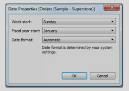
- Dates can be Discreet or Continuous. The date level of a field can be changed by dropping it into the Row or Column shelf and selecting a pill drop menu. Using this menu, dates can be changed between discreet and continuous.
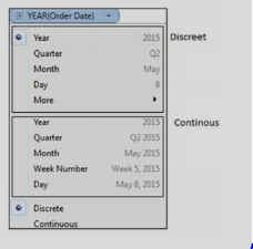
- Sometimes Dates are not interpreted correctly by Tableau and dates - comes as String or some other format. In such cases, a field can be converted to Date in Tableau. On the data window, right-click on the field and select “Change Data Type”.
- Custom date format can be created by right-clicking on the date field and selecting Create Custom Date.
- Dates functions available in Tableau are
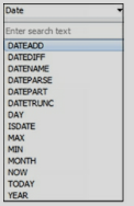
a) Inner Join. Returns matching rows from both the tables.
b) Left/Outer join. Returns all rows from the left table and the matched rows from the right table.
c) Right/Outer join. Returns all rows from the Right table and the matched rows from the left table.
d) Full/Outer join. Returns all rows from table1 and from the table. It combines the result of both LEFT and RIGHT joins.
e) Cartesian join. Join every row of one table to every row of another table.
Discreet data contains specific categories. For example, Regions - South and North or Years like 2011, 2012.
Continuous data, on the other hand, is defined by a range and it can take any value over a continuous range.
In Tableau, Dimensions are discreet and Measures are continuous.
Measures are continuous and when dropped on the Color shelf shows a gradient color.
-When connecting to data, Tableau provides an option to connect to data Live or as an Extract.
-Data can be extracted to a .tde file. Extracts are faster than live connections.
-When data is extracted, the symbol of the data source changes in the data window. It shows up with two cylinders.

-Data Source can be saved as a TDS file or published to Tableau Server.
Exercise: Use Tableau sample data source Sample- Superstore.xls located under \My Tableau Repository\Data sources.
Connect to data live or as an extract.
When connected as an extract, it will provide an option to save the data source as a TDE file.
- Dimension fields contain the textual attribute of the data. It provides the context to the Measure. Dimensions are generally used to create labels and filters. Dimensions are discreet and appear blue in color in the data pane and the view.
- Measure fields contain the measurable attribute of the data - such as Revenue, Profit, or Population. Measures are continuous. They are axis in the charts and appear green color. Measures are analyzed by dimensions.
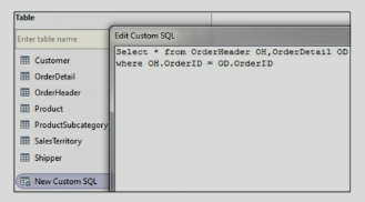
- Review your source data to see if data is formatted correctly. If multiple tables or excel sheets are involved, look for the relationships between them. Create appropriate joins.
- For successful visualization, data should have dimensions and measures.
- If the source data contains a wrongly formatted Excel file, utilize Data Interpreter to format the file.
- Use Split to segregate concatenated columns and use Pivot to transform Rows to Columns.
- Data preparation may include renaming columns, creating hierarchies, Groups, and calculations.
-The Data source should be given a user-friendly name. Right-click on Data Source and select Rename.
-Dimension and Measure columns should be given user-friendly names. Right-click on a field and select Rename.
-the data types of the fields. If data types are incorrect then change the datatypes in Tableau.
-Related fields should be organized in Folders. Right-click on a field and select Group By/ Folder.
-Hierarchies help in drill-downs. Identify the columns to be included Hierarchy. Create Hierarchy by Shift or Ctrl select the columns to be included in Hierarchy, right-click, and select Hierarchy.
-Provide Aliases to give a meaningful description of the values. For example, if the Region is SZ, you can alias it to South Zone.
-Hide the columns, dimensions, and measures which are not used in the calculations or the view.
-Create Calculations to achieve the required functionality. Name calculations in a user-friendly manner.
-Apply appropriate filters to get meaning full data.
-Use extract when possible. Extracts are faster than live connections.
-Save the data source as a TDS file. This file can be shared and other developers can use this file for development.
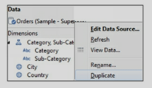
Exercise: Use Tableau sample data source Sample- Superstore.xls located under \My Tableau Repository\Data sources. Use the Orders datasheet and prepare data for dashboarding. Refer to downloaded workbook – Review Dimensions and Measures.
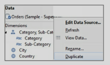
Copy of the data source can be useful when you have to create additional view/s of the same data source to create some visualizations like two separate charts for Year by Year comparisons.
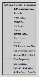
While connecting to the data source, other developers can connect to the data source from the Tableau server option.
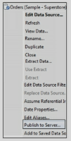
Developers using the published data source will be allowed to create their own calculations on the data source.
-When an extract is created, the symbol of the data source icon changes to two cylinders.
-Extracts result in better performance as compared to live connections.
-Extracts are useful in offline access to data. Extracts can be saved locally and do not require a live connection to the source data.
-The extract is a snapshot of data, it needs to be refreshed as underlying data changes.
-Filters can be applied while creating an extract.
-While creating an extract data can be aggregated by dimensions.
-An extract can be created for all the rows or incrementally.
-Extract refreshes can be scheduled to run.
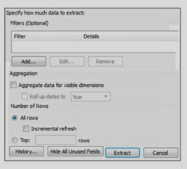
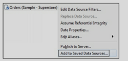
TDS file is in XML format and contains the following information
- Data Source Type.
- Data Source connection details such as Server, Port, Location of local files.
- Joins, tables joined and type of join.
- Groups
- Sets
- Calculated fields
- Bins
- Default field properties such as number formats, aggregation, and sort Order.
Exercise: Use the file you have created in the previous section and save the data source .TDS file under \My Tableau Repository\Data sources. Navigate to the above path and open .Tds file and review it in a notepad.
- In Data blending, one data source becomes primary and the second data source becomes secondary.
- Data blending is not a join. Join occurs between the tables from the same data source.
-To perform data blending there should be at least one common column between the data sources.
- If a common field does not exist, then edit the relationship between the data sources. To edit relationships, navigate to the menu, and select Data/EditRelationships.
- Data blending can be applied per visualization, it does not carry over to the entire workbook.

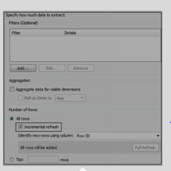
Measure filter is similar to the HAVING clause.
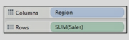
-Dimensions are discreet and Measures are continuous.
-Discreet pills are blue in color and continuous are green in color.
-Dimension and Measure can be changed to discreet or continuous by right-clicking and selecting the desired type.
-When a continuous pill is dropped into the view it creates an axis.
-When a discreet pill is dropped into the view, it creates a label/header.
-Color is also decided to depend on whether - the pill is continuous or discreet.
-Filtering on a discreet field such as category will ask for the specific values.
-Filtering the continuous field such as profit will first ask if you want to filter at the row-level or
-Aggregate level and then bring up options for continuous ranges.
-In Maps, the default color depends on whether a field is continuous or discreet.
-A measure on Color will create a filled map. A dimension on the color will create a Symbol map. But whether the color is gradient or palette still depends on whether the pill/field is continuous or discreet.
Exercise: Use Tableau sample data source Sample- Superstore.xls located under \My Tableau Repository\Data sources.
Create a Map by using State and Region in one sheet and State and Sales in another sheet.
Refer to downloaded workbook – sheet/s - SymbolMap_Color and FilledMap_Color.
-Fields can be organized in folders.
-Keep related fields in a folder.
-Hide all unused fields.
-Workbook many contain multiple sheets and dashboards. Color related sheets and dashboards.
-Hide unused worksheets.
- Add a new data source to Tableau. Navigate to the main menu and select Data/New Data Source
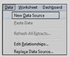
- Make sure the new data source contains the same data structure in terms of calculations, hierarchies, parameters, etc.
- Right-click on the old data source and select Replace data.
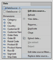
- Select the Current and Replacement data sources
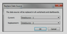
- After replacing the Datasource, close the original data source.
The data interpreter option is invoked automatically when Tableau recognizes that data is not in the right format.

Data Interpreter formats the data correctly and also provides you the option to Pivot the columns into rows.

Types of calculations available are:
a) Regular Calculations. This calculation is sent to the data source for processing and the result is returned to Tableau.
b) Table Calculation. Calculation occurs on top of the returned result set or chart.
c)Quick Table Calculation. These calculations are predefined Table calculations provided by Tableau.
d) Level of Detail (LOD) calculation. This calculation computes aggregation that is out of the level of detail of the view.
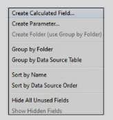
A calculated field can also be created by navigating to the Menu/Analysis and selecting Create Calculated Field.
A calculated field can use any of the Tableau defined functions such as
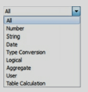
Exercise: Use Tableau sample data source Sample- Superstore.xls located under \My Tableau Repository\Data sources. Use the Orders Datasheet. Create a calculation for Sales with Discount. Use the formula:
Sales * Discount.
Create a visualization by placing dimensions and measures on the view canvas. Click on the measure pill and select Add Table Calculation.

Table calculation can also be created just like regular calculation but will use the Table calculation functions.

Exercise: Use Tableau sample data source Sample- Superstore.xls located under \My Tableau Repository\Data sources.
Use the Orders datasheet. Place State on Rows and Sales on the Columns Shelf. Click on the Pill to add Table Calculation for Rank.
Quick Table calculations also work on returned result set and are created by right-clicking on the measure pill on the view canvas and selecting “Quick Table Calculation” The types of quick calculations available are
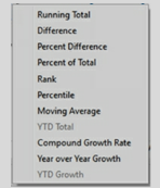
Addressing field provides the direction in which the calculation will take place.
Exercise: Use Tableau sample data source Sample- Superstore.xls located under \My Tableau Repository\Data sources.
Use the Orders datasheet.
Place Order Date on the Rows, drill down to Quarters. Double click on Sales. Create a Table calculation for “Running Total”. After the visualization is created, navigate to Sum(Sales) and select edit Table calculation.
Under Running Along, choose the option for Advanced and see which columns are used for Partitioning and Addressing. Switch the columns around to see the changes in the output. .
First, Last and Index Table calculation functions provide information about the position of a data element within a partition.
First() – returns the number of rows from the current row to the first row in the partition. It is a negative number.
Last () – returns the number of rows from the current row to the last row in the partition. It is a positive number.
Index() – returns the index of the current row in the partition. The first-row index starts with
1. Exercise: Create an example to understand First, Last and Index functions.
Place Category on the Rows and drill down to Sub-Category. Place Sales on the Columns. Create calculations for First(), Last(), and Index() and place them on the table in the view canvas.
Observe the output.
Navigate to the function pills on the left under Marks and use Compute using to change the partitioning fields and see the difference in your output.
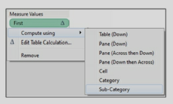
LOD expression has a specific syntax and works with keywords such as Include, Exclude, and Fixed. LOD calculation follows the below syntax
{Keyword [Dim1],[Dim2]: Sum(Measure field)}.
a) Fixed computes the value using the mentioned dimensions ignoring the dimension in the view
b) Include computes the value using the mentioned dimension in addition to the dimensions in the view
c) Exclude will ignore the mentioned dimension. It ignores the dimension even if it is used in the view.
d) If no dimension or Keyword is specified then the expression is “Table scoped” which is the complete aggregate of the data. {Sum(Sales)}
e) Only field names can be used in the Dimension declaration. Calculated fields can be used but not the calculation expression. Sets, parameters, or Table calculations are not allowed.
f) The LOD expressions that use Exclude or Include always result in measures. These results cannot be binned.
g) Fixed can be an expression or a dimension based on the aggregation used. If the aggregate expression results in a measure then the overall expression will be a measure. If aggregation such as string, Boolean, or Date types results in dimension then the overall expression will be a dimension. The fixed expression can be converted to a dimension or a measure.
h) Numeric Fixed LOD expressions can be binned unless the aggregate expression is a date.
{Fixed [State]: SUM ([Profit])}
This expression will compute at the State level. It will ignore the dimension in the view i.e. ZipCode.
Whenever we need to check for a single value such as if State = “NJ”, use Attr

This error occurs when a dimension is used with an aggregated function. If the dimension returns more than one row of data, this error occurs. This error can be resolved by using the ATTR function with the dimension
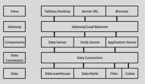
1)Data.Tableau can connect to any format of source data.
2)Data Connectors. Tableau provides over 40 optimized data connectors. To various data sources such as MS Excel, MS SQL Server, Google Big Query, Amazon RedShift, Oracle, and others.
It also provides a generic ODBC connector for systems without a native connector.
Data can be used in-memory or live.
3)Components. The following components handle the server operations
a)Application server. Application Server processes (wgserver.exe) handle content browsing, Server- Administration, and authentication to Tableau server web and mobile interfaces.
b)VizQL Server. When a user/client requests a visualization, it sends a request to the VizQL process (Vizqlserver.exe). The VizQL process in turn sends queries to the data source, returning a result set in the form of images.
c)Data Server. It facilitates the management of data sources on the server.
4)Gateway/Load balancer. Gateway directs requests to other components.
5)View. Users can view Tableau dashboards thru Tableau desktop or via zero-footprint HTML 5 in a web or mobile browser.
-The developer uses Tableau desktop to create visualizations, dashboards, and stories.
-Dashboards can be deployed on the Tableau Server. Users can access dashboards stored on the server through the server URL. Tableau desktop can use data as a “Live” connection or as an “Extract” (TDE).
-Data connection/s used in developing dashboards is reusable. It can be published to the server. Data load schedules can be created to meet user requirements.
-Tableau desktop design file is called a “Workbook”. It has an extension .twb.
-Tableau workbooks can also be packaged with data. This packaged workbook is a zip file with extension .twbx.
-In the absence of the server, Tableau design files can be viewed by using Tableau Reader. Tableau reader is also a free download and can open twbx files.
Tableau dashboards are interactive and display the whole picture of the data. All the data is present, data analysis across different time periods and dimensions is faster.
Datasource used in the dashboard design can be shared with other developers and users, this helps in maintaining the single version of the truth.
Development is faster as compared to other applications. Tableau provides easy to use functionalities to create data hierarchy, calculated fields, filters, parameters, Sets, and Bins.
Development is not IT-centric. It gives power to business users. Users can design their own dashboards.
Creating worksheets, dashboards, and stories are easy.
Based on the data, Tableau’s “Show Me” feature suggests users the best visualization type to use. This helps novice users in creating meaningful charts and tables.
Tableau can handle huge amounts of data. Connection to the data can be live or to an extract.
For a quick review, workbooks can be emailed as packaged workbooks with data.
Publishing to the server and applying security is easy.
-Und<brerstanding business requirements.
-Analyzing data sources and relationships.
-Extracting data from the required data sources. Making decisions in collaboration with Business users on connecting data live or as an extract.
-Applying required data transformations, creating calculations, Sets, Bins as driven by the requirements.
-Creating visualizations that help in answering business questions. These visualizations are created and displayed in Sheets, dashboards, and stories.
-Deploying the dashboards on the server
The car dashboard provides the complete status of the working of a car, such as Gas, mileage, Air pressure, and so on.
BI Dashboard provides a snapshot of the organization or Key Performance Indicator (KPI).
- or from the Menu/ Dashboard.
- Dashboards contain one or multiple sheets.
- Actions provide interactivity to the dashboards.
- Filters present in the individual sheets are to dashboards too. These filters can be applied to a specific sheet or all sheets using the data source.
- The dashboard contains “Dashboard Objects”. These objects are available in the left pane. These dashboard objects are layout containers – horizontal or vertical. These objects can be used to add Image, webpage, text, and Blank container. Use these objects to enhance your dashboard.
- Dashboard size and sheet coordinates can also be specified.
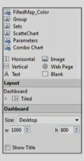
Exercise: Create a Dashboard using Sheets, FilledMap_color, Combo chart, Parameters, and TableCalculation_Rank.
Filter Actions. This type of Action is used to create interaction between the sheets in a dashboard.
Highlight Actions. It is used to color the selected Marks on a chart.
URL Actions. This type of Action is used to create a hyperlink to another webpage.
Actions can be configured by navigating to Menu – Dashboard/Actions.
- Use folders to organize related fields or calculations.
- Name the data connections appropriately.
- Use standard naming conventions for the calculated fields.
- Use a standard naming convention for the parameters.
- Use standard naming conventions to name the sheets and dashboards.
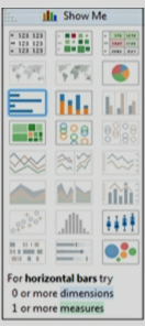
Place Region on the Columns Shelf. Drop Sales and Profit on the Rows shelf.
Right-click on the pill of Profit and select Dual Axis.
Click on Sum(Sales) pill and change the Mark Type to Bar
Click on Sum(Profit) pill and change the Mark Type to Line.
Exercise: Use Orders datasheet. Create the above combo chart for Sales and Profit by Region.
Data Source filters. These filters are added to the data source. These filters restrict whole data.

Extract filters. These filters are implemented while creating an extract. Right-click on the data source and select Extract data. In the extract data options, select the filter/s.
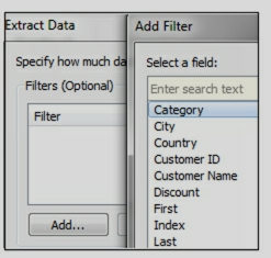
Context filters. These filters create a subset of data. Context filter, if applied, acts like a temp table. All the other filters act on this sub-set of data.
Quick filters. These filters give the user an option to select a filter while viewing a dashboard or a visualization. Place a field on the Filters shelf, right-click and select “Show filter”
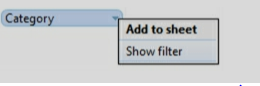
- Parameters provide a dynamic value to the hardcoded or constant value in a visualization.
- Parameters are single select and provide context only when used in a calculated field.
- Parameters can work as a data input to the visualization.
- A good use of parameter will be, for example, if you want to change the measure in a chart based on the values selected by a user.
- Parameters are displayed at the bottom of the data section.
Use this parameter in a calculated field, say, “Select Measure” Create a visualization using this calculated field Select Measure.
Display the “Param Select Measure” for user selection.
Exercise: Create a new sheet, use Region, Sales, Profit, and Quantity.
Create a parameter, so that the user can pick a measure from the list and it should change the measure in the visualization.
- Sorting can be ascending or descending. Sorting can be on dimensions or measures.
- Sorting options can be selected from the toolbar.

- Pill sorting option is available only for dimensions.
- Sorting can also be performed by dragging and dropping data elements on a chart.
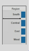
- Color legends also can be sorted by manually.
-Tableau automatically identifies geographical fields like County, State, City and zip-codes. It assigns Latitude and Longitude to each value of the field based on the data present in Tableau Map-Server.
-Fields having the geographical role assigned can be identified by a globe symbol next to them.
-Sometimes Tableau cannot recognize a field as a geographical location. For example, sometimes Zip code would be identified as a number. In such instances, you can right-click and assign a geographical role to the field.
-If Tableau does not contain the desired Latitudes and Longitudes, you can define them in a database or a CSV file.
Geographical roles available in Tableau are
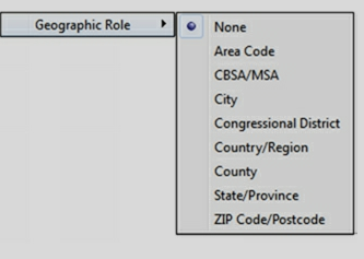
-Area code contains USA telephone area codes.
-CBSA/MSA denotes USA metropolitan Statistical Areas.
- City represents worldwide cities with a a population of more than 15,000.
-Congressional District represents U.S. congressional districts.
-County/Region represents worldwide countries.
-County represents counties of few countries such as the USA, France, German, etc.
-State/Province represents worldwide states.
-Zipcode/ Postal code of selected countries are available
Exercise: Use Tableau sample data source Sample- Superstore.xls located under \My Tableau Repository\Data sources.
Use the Orders datasheet. Place State on Rows and Sales on the Column Shelf. This will create a Map that will give Sales for each State.
In such a scenario, drop State on the Detail shelf.
Alternatively, you can click on “146 Unknown” and from the popup dialogue box select “Edit Locations”
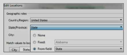
The dimension field dropped in the Detail shelf will change the granularity of the visualization.
Dropping measures in the Detail shelf will have no effect.
- The tooltip displays the data description when the user hovers over the data elements of the chart.
- The tooltip displays the data elements that are in the view canvas. You can display other data elements by placing them on the Detail. Use those data elements that do not change the granularity of the data.
- Tool Tip can be formatted to add different colors and fonts.
- Any comments can also be displayed in the ToolTip.
The screenshot is given below shows Tooltip when the user hovers over a state in the Map.
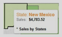
Go to the Target Sheet or other sheets - where you want to copy the formatting, right-click on the sheet and select “Paste formatting”.
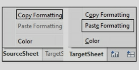
Groups are used to combine different dimension values. Once grouped, these values show up as a new dimension field under Dimensions. Group is also used to improve data quality in a dashboard. For eg., if visualization contains values such as Unites States, USA, US, you can combine all these values into one Group and have a value like the USA.
On a Bar chart, select the headers of a dimension and click on the “pin” icon.
a scatter chart, highlight the marks on the chart and click on the “pin” icon to the group.
Group can also be created in the data window. Groups can also be calculated by creating a calculated field.
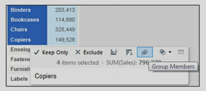
Exercise: Use Tableau sample data source Sample- Superstore.xls Use Orders datasheet. Create a Group called Office Supplier – Group.
Bins, when created, display as a field under Dimensions.
Bins are created by right-clicking on a measure field and selecting Create/Bins. Tableau suggests the size of the Bin or it can be entered by the developer.
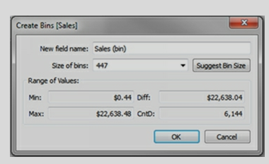
Bins can also be created by using a calculated field.
-The color of a data element is decided by it being continuous or discreet.
-A discreet field on the Color shelf produces a “color palette”. A continuous field creates a “gradient”.
-Click on the color shelf to Edit Colors. To display consistent color, double click on the color and provide HTML code or RGB values.
If no custom color is specified, this file appears with place holder such as
-?xml version='1.0'?>
-workbook>
-/workbook>
Custom color can be specified in this file by using the HTML tags for Color Type and hexadecimal value.
-Sets can be created manually from the visualization in view canvas. On a scatter graph, highlight the marks which you want to use to create a Set, and select Create Set by clicking on the overlapping circle icon from the pop-up toolbar.
-Sets can also be created dynamically from the data section. Right-click on any dimension and select Create/Sets. On the dialogue box, navigate to Top
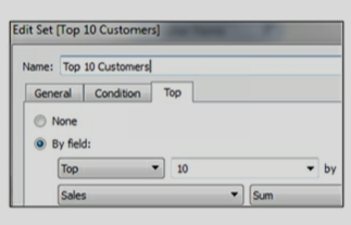
-Sets can be used with other sets. Sets can be used as a filter. They can also be used in a calculated field.
-Sets once created, show up in the data section below Measures.
-Sets are available in all the sheets and can be used in multiple visualizations.
-Exercise: Use Tableau sample data source Sample- Superstore.xls Use Orders datasheet. Create a SET for Top 10 Customers by Sales.
- A set can be used as a filter. Filters are available only in one sheet but Sets are available as a part of data and therefore available in any sheet you create.
- Since Set becomes a part of the data, it is available when the data source is saved as a.TDS file and shared across other dashboards.
- Sets get created automatically when Action is used in a dashboard.
- Sets get created, when User filter is applied to the dashboard for security.
It’s said that if a Billionaire walks into a cheap bar, the average crowd becomes a millionaire
1. Whether the relationship is positive or negative
2. The strength of the relationship.
Let's list the combinations that result in sums greater than 9.
(4,6) (6,4) (5,5) (6,5) (5,6) (6,6)
That's 6 out of the 36 total possibilities. Therefore, the remaining 30/36 possibilities fulfill the less than or equal to 9 requirements. Simplifying by a factor of 6, that's 5/6 chance.
Practically, Also there’s a tradeoff between having more data and the additional storage, computational power, memory it requires. Hence, always think about the cost of having more data.
Leave the model as is, despite multicollinearity. The presence of multicollinearity doesn’t affect the efficiency of extrapolating the fitted model to new data provided that the predictor variables follow the same pattern of multicollinearity in the new data as in the data on which the regression model is based.
principal component regression
-A/B Test
-Student’s T Test
-Chi Square Test
-Fisher’s Exact Test
-Mann-Whitney Test
- To create any visualization, the developer needs to drop Dimension and/or Measure on the view canvas.
- When you drop a measure in the view canvas, Tableau automatically aggregates the data. Default aggregation is Sum. These aggregations can be changed to other types.
- Show Me feature suggests the best visualization for the number of Dimensions and Measures selected.
- Dimensions or measures can be used to create filters and quick filters. These filters or quick filters help in providing context to the data.
- Visualization can have Color, calculated field, Shape, and Size.
-One or multiple Sheets are combined to create a Dashboard.
-Sheets and Dashboards are used to create a Story.
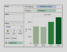
FROM emp
GROUP BY deptno
HAVING count(*)>3;
a) Cross Validation: One of the best ways to prevent overfitting is the technique of Cross Validation.
In the simplest version of this technique, we divide the dataset into two populations.
One is a training population and the other is the testing population.
By using Cross-Validation, we use the training population to create the model, whereas the testing population is used for testing the model. Once we have the correct model, it works well with training as well as the test population.
Further, there are many versions of cross-validation by performing test/train split in different ways. One popular method is called K-fold cross-validation.
b) Collect more Data: We can also avoid overfitting by collecting more data in the first place. When we have a small dataset, the chances of overfitting increase. We can collect more data to build the correct model.
c) Reduce the number of features: In a complex model with the problem of overfitting, it is better to reduce the number of features that are not strong predictors. This helps in reducing the variance as well as boosting the performance of the model.
d) Stopping Early: When we iterate multiple times to get a model, it can memorize the data. In such a scenario overfitting occurs. To prevent this situation, we can stop early in the iterations. This helps in stopping the training process at an optimum point.
- a) Inductive learning
- b) Unsupervised learning
- c) Recommendation system
- d) Predictive modeling
- e) Artificial Neural Networks
- f) Decision tree learning
- g) Deep learning
- h) Support vector machine
- i) Clustering
- j) Bayesian networks
a. Classification Tree: In a classification tree, class labels are represented by leaves in the tree. The branches of the tree represent the conjunction of features. There are distinct classes in a classification tree,
b. Regression Tree: In a regression tree, the target variable can take continuous values. It means the result can be a wide range of values. The regression tree is built by binary recursive partitioning.
- a) Linear Regression
- b) Logistic Regression
- c) K Nearest Neighbor (KNN)
- d) Decision Tree Learning
- e) Artificial Neural Network
- f) Gradient Boosting Algorithm
- g) Naive Bayes Algorithm
- h) Support Vector Machine (SVM)
a) Web Browser
b) Cloud based application
c) Mobile applications
d) Business software
a) Infrastructure as a service (IaaS)
b) Platform as a service (PaaS)
c) Software as a service (SaaS)
a) Public Cloud – Standard cloud computing model.
b) Community Cloud – Infrastructure shared between several organizations.
c) Hybrid Cloud – Composed of multiple clouds bound together to provide services.
d) Private Cloud – Clouds intended for a single organization only.
a) Security of stored data.
b) Availability and reliability of offered service.
c) Transfer speeds and general performance.
a) Cloud Infrastructure
b) Cloud Platform
c) Cloud Application
a) Scalability and elasticity – Increase or decrease services on demand
b) Self-service provisioning – Help yourself in major problematic scenarios without waiting for the response of your provider
c) Pay-per-usage billing model – Pay for what you use
d) Standardized interfaces – Interfaces applicable to all major models
a) Accessing and managing software
b) Serve several clients at a given time
c) Centralizing all activities in a Web environment
d) Centralize the updating feature of the software
b) Excessive dependability on the service provider.
c) Data disaster recovery can be a major concern.
d) There are many problems associated with data migration if you change your service provider.
e) What happens if the provider goes out of business?
b) Advantage of mobility – Excess anything, anywhere
c) Cost-efficient
d) Effective resource sharing
e) Pay for what you use, rather than paying for what you own
f) On-demand scalability at any instance
a) Secure transfer of your data – No external attacks while the transfer of data from/to the cloud.
b) Location of your data – Geographical location of data.
c) Control of your data – Who has access to your data?
a) Security of data
b) Speed of data transmission
a) There is a large audience for this model.
b) It is highly fault-tolerant.
c) HTTPS-encrypted access provides privacy.
d) Many provider options are available.
e) It is cost-effective.
b) Service-level agreements (SLAs) are difficult to reach
c) Latency problems are widespread
d) Downtime is out of your control
a) Bare-metal Hypervisor – runs directly on hardware.
b)Virtualized Hypervisors – run on a virtualized platform.
b) Accelerated internet
c) Optimized overlay
d) Site-to-site VPN
b) The round-trip time between the cloud and your organization
c) The actual response time of the cloud
a) Time to value
b) Trial period – How long is the trial period of the service?
c) Low entry costs
d) Offered Service – What is the level of service required?
e) Total Investment – How much investment is required in your choice of Cloud?
f) Security – How secure is your data?
g) Reduced Capital Expense – How much you save when you switch to another service?
a) Customer-oriented services – Offered to the general public on a subscription
b) Line of business services – Offered to enterprises and companies via subscription
a) Security of stored data.
b) Availability and reliability of offered service.
c) Transfer speeds and general performance.
E.g. the price of a house can range from $5000 to $1,500,000 based on the square ft. area, year of making, size of the lot, etc. It can be any number between this range.
One of the simple ways of performing Linear Regression is by drawing a straight line. Once we have the best fit line based on our training data, we can use it for predicting the value of actual data.
In a straight line we have to estimate the slope a and b intercept. The equation is:
y = aX + b
Let say we have a graph with X = sq. ft. of house and y = price of the house. Our model can estimate and give us a = 100 and b = 190 for the best fit line.
Now we can get the value of any house by using following formula:
y = 100X + 190
We just need to replace X with the sq. ft. of the house to get the price of the house.
In Linear regression X is the independent variable and y is the dependent variable. The value of y is dependent on the value of X.
We can use it to determine the class of data. It can be a binary class like 0,1 or yes, no, etc.
The Logistic regression is based on probability. In this case, the probability lies between 0 and 1. We use the log of the value to create a step function. The step function can distribute the values among the two classes.
E.g. Let say we want to predict whether it will be a rainy day or not based on the temperature on a day. We have to give one of the two answers.
True for a rainy day and false for a sunny day. We can use the temperature in our model to predict the probability of rain.
Then we take the log of this probability to divide into two classes. It can be 0 or 1. We can use 0 for a sunny day and 1 for a rainy day.
The model in this approach is a general model and is called algorithm independent.
We can create a model that provides similar results even after using different types of algorithms.
This helps in validating our approach and provides independent analyses approach for our model.
On the desired chart, click on the pulldown menu on the right and select Use as Filter.
User-based licensing restricts how many users can work on your installation of Tableau Server. Tableau Server can be installed on a single machine or multiple machines in a cluster.
Core-based licensing provides a license on the number of cores on a single machine installation or multi-node installation. It does not restrict the number of users in the system.
In such an implementation/s, the team can be divided into data modelers and dashboard designers. Alternatively, one complete dashboard can be assigned to a single developer. But when the dashboard is huge then multiple developers can work on the same dashboard and create a visualization in separate workbooks.
There can be many ways to implement such scenarios
- Data modeler/s create data sources and save it as TDS file or publish it to the server. This will ensure that all data standards and transformations are maintained.
- Developers connect to this published data source to develop dashboards.
- If sheets are developed by different developers, then they can be merged into a single dashboard by performing copy/paste.
- Once all sheets are merged into one workbook, there will be many data sources as data sources are tied to the sheets. These data sources are to be replaced by the primary data source and all other data sources can be closed.
- Check it against the original data source. Check the count of rows in Tableau by using the “Number of Records” measure and source table.
- Compare the aggregations in the charts against the database SQL.
- For excel data sources, use excel filters and formulas.
- Export the data out of Tableau, by right-clicking on the chart and selecting view data
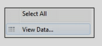
- Use a performance recorder to gain knowledge of the performance of different sheets and actions in a workbook.
- Use extracts, if possible. Extracts are faster than live connections.
- Minimize the number of fields in your workbook. Hide fields that are not required.
- Reduce the number of filters used on a worksheet and dashboard. In Tableau, filters are applied separately and each time a query is sent to the data source. Multiple filters will slow down the application.
- All complex calculations should be performed at the data source level.
- The number of sheets will affect performance. Delete or hide any unused sheets.
Sheets or Dashboards make up a Story. A Story can contain multiple tabs. The story is created like any other sheet by clicking on the icon at the bottom of the screen
Exercise: If you have created different sheets and dashboards using the previous exercises, create a Story by using FilledMap_Color, Db_SalesDashboard, and Sets sheets/Dashboards.
- Open your workbook on Tableau desktop.
- -Navigate to Menu/Server and select Publish Workbook
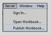
- It will ask you for the server credentials. On successful login, you will get the options to publish your entire workbook or specific sheets.
- Entire workbook or specific sheets in a workbook can be published.
User Filter will work when Users login to the Tableau Server. To implement User Filter, you should have access to Tableau Server.
To create a User filter, on Tableau Desktop, navigate to Menu-Server. Login to the Server.
Navigate to Menu – Server – Create User Filter using the Segment.
In this way when the User login’s he will see the data only for his segment
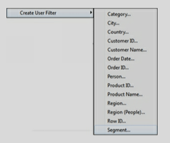
- Navigate to your sheet and right-click on your data source and select “Publish to Server”
- On Publish Data Source to Tableau Server dialogue, you can set the schedule.
- This will publish and set the schedule on the Server.
- This schedule can be modified at any time.
- Data sources should be created only once. All the common transformations and calculations should be present in this data source.
- The data source should be shared with other users creating the dashboards. Data Source/s can be shared by publishing them on the server or by creating a TDS file.
- The look and feel of the dashboard should be the same. Color scheme, fonts, etc. should be decided and implemented in all the dashboards.
- Create a dashboard review board that will review all the dashboards before moving to production. This will ensure that standards are maintained.
When you drop a measure field, the aggregation applied is Sum.
This aggregation can be changed to Average or any other type. When an “aggregated measure” is used in a calculation and then the calculation is placed on the view canvas, it shows Agg in front of the calculated column. It means that aggregation is built within the calculation. This aggregation cannot be changed.
What-if analysis can be performed by the use of Parameters.
- This feature can be turned-on on the Tableau desktop and can be turned off once the recording is done.
- This feature records performance information on the various events on a dashboard as users interact with the worksheets and visualization.
- It creates a workbook under \Documents\My Tableau Repository\Logs. The name of this workbook is similar to performance_20160808T084552_11184.tab.
- This workbook can be analyzed for performance metrics.
- To turn-on performance recording, navigate to help on the menu and select.
- Review the data sources. Edit the data source to see if any filter is used while extracting the data. Check to see if the connection is a live connection or an extract.
- The developer may have renamed the dimensions and measures. Right-click on the dimensions and measures and select Describe getting information on the source columns.
- Fields prefixed with = are calculated fields. Right-click and edit to understand their definition.
- A delta symbol next to the measure pill in the view shows that Table Calculation is implemented. Edit Table Calculation to understand the definition.
- At the bottom of the data, the window looks for Parameters and Sets. You can edit and view the definitions of these elements.
- Right-click on the status bar and select “Unhide” to display the hidden sheets.
- See the symbols of the data source to understand if they are extracts and if using data blending.
- Check the output of the dashboards to see different sheets. See what data elements, objects, sheets are displayed on the dashboard.
- Check for any aliases in the fields.
- Look for the Actions in the dashboard. On the Menu, click on the “Dashboard” and navigate to “Actions”.
- Locate the log files under “My Repository folder”.
- Design a dashboard for a specific Screen resolution. Discuss with your user community and decide on a screen resolution that will cater to all the user's
- Design a Screen layout which makes the navigation on the screen natural and easy.
- Avoid using complex calculations in the dashboard. Move such calculations to the data source.
- Use muted colors. So that focus is on the dashboard not on the color.
- Create a template and include all the layout related attributes on this template. Use this template to develop dashboards.
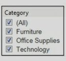
From the pulldown menu of the quick filter, select Customize and uncheck “Show “All” Value.
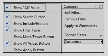
Traditional methodology or waterfall model, worked in sequential order – Feasibility study, Requirements, Design, Testing, Deployment, and support. This method though good for complex systems, considered to be time-consuming in answering business questions at a rapid pace.
Agile methodology on the other hand facilitated the rapid development of the application. The development team worked closely with the business users and helped in faster delivery of the application.
The purpose of the training dataset is to discover the predictive relationship by using a model. With the training dataset, the model can learn the behavior of data and tweak itself. The model is built based on the data it discovers in the training dataset.
Once the model is mature, we use the test dataset to get the accuracy of the hypothesis. Since the model has not seen the test dataset during the training phase, it gives us impartial results. Therefore, it is very important to keep the test dataset separate from the training data set.
Sometimes the model gets the problem of overfitting the data. It can occur when training and test datasets get mixed up.